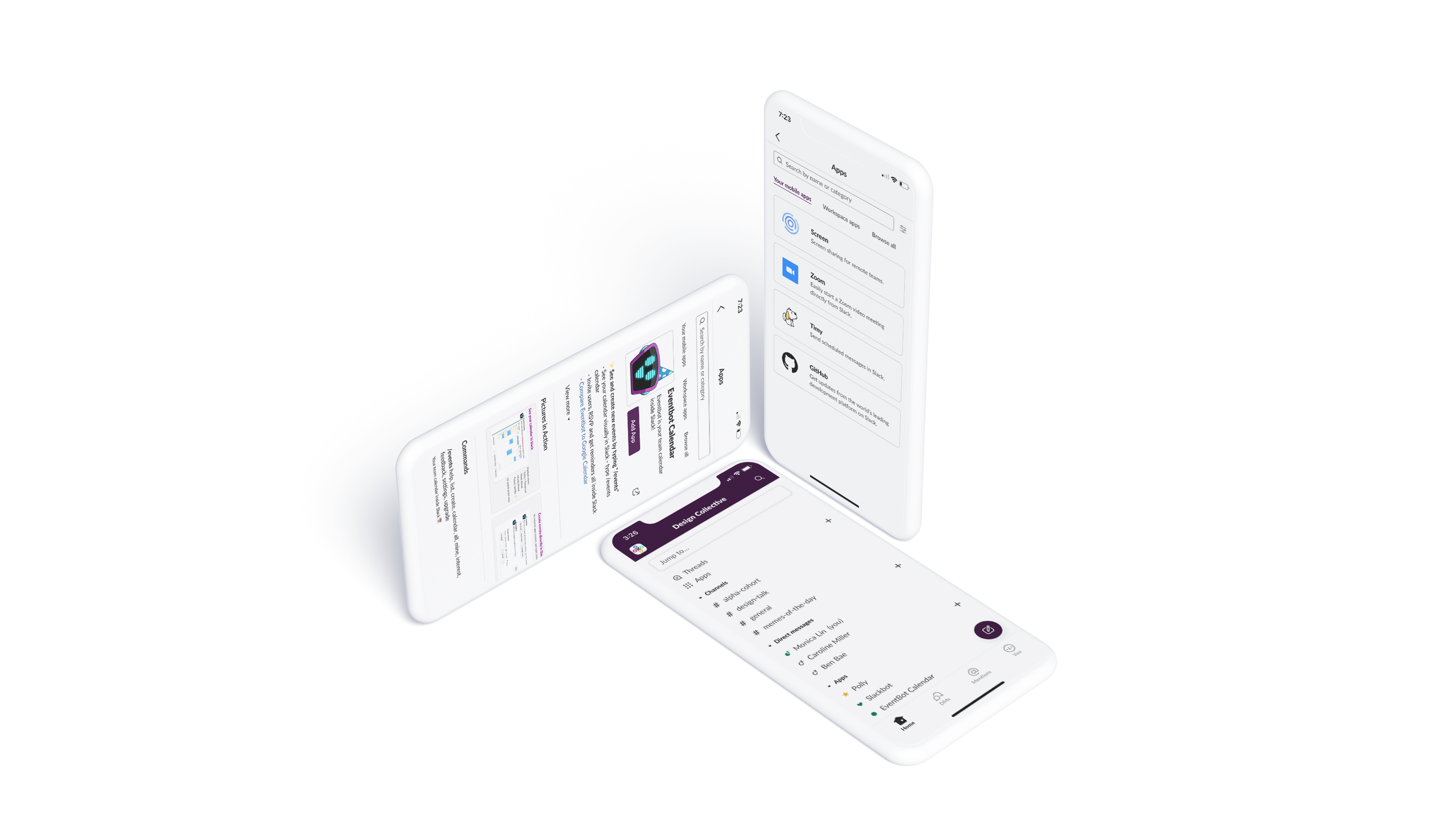
Slack is a powerful productivity tool that allows users to send convenient messages in workspaces. To empower users further, Slack allows them to add "Apps" for extra functionalities that may be important for work, such as Polly for creating polls, Zoom for scheduling video calls, Google Drive for linking documents, and more. I wanted to increase visibility of this feature on mobile so that users could access additional functionalities anywhere at anytime.
WHO
I ideated, created, and designed this project.
WHAT
A submission for the KPCB Design Fellows 2020 app.
WHEN
October 1 to October 16, 2020 (about two weeks.)
If you work at a company or are in any clubs in college, chances are that you've used Slack before. I'm currently part of five workspaces myself. Though Slack is useful for quick messages, it also has additional functionalities that you can access by downloading "Apps." These Apps connect products, such as Github, Zendesk, Google Calendar, and more, to your workspace so that you can be as productive as possible with one service: Slack.
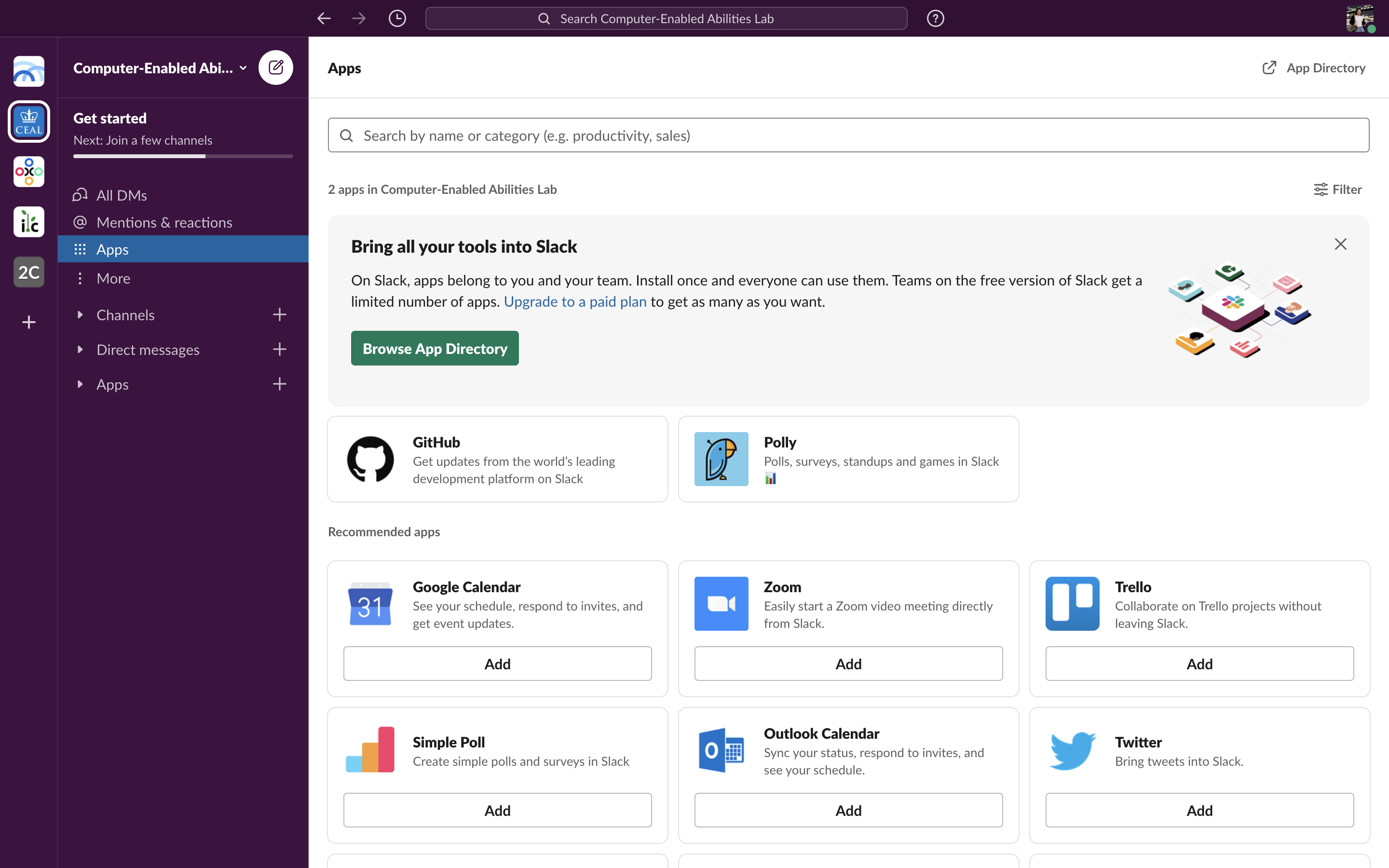
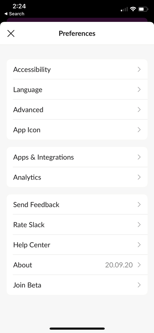
Though it's easy to find where to add and access Apps on desktop, there is currently no (easy) way to download Apps on mobile. Though users can access ones they've already installed on their laptop, I wanted to implement Apps on mobile so that users can easily download, toggle, and customize Apps on their mobile devices as well.
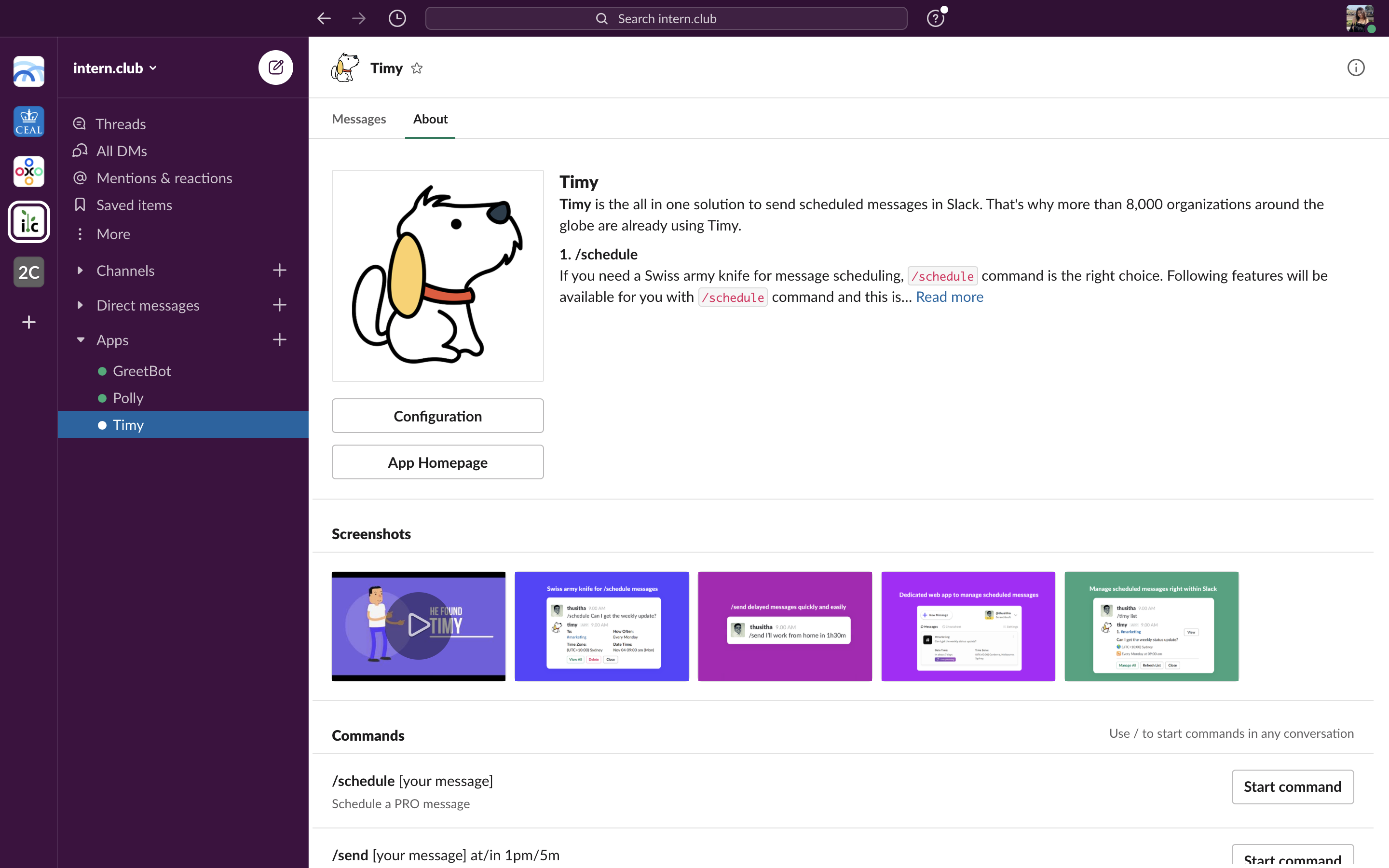
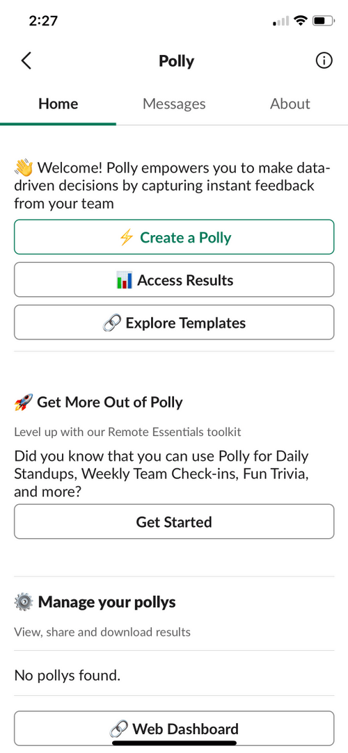
Slack's mission is to "[make] work simpler, more pleasant, and more productive," and by adding more accessibility to Apps, I believe that Slack will do all of the above. Have your hands full making lunch but need to respond to a team member? Download "Voice Message" to send a recording instantly. In bed at 3:30 AM but just remembered something you need to tell your manager? Use "Timy" to schedule a message for 9 AM from the comfort of your sheets. The possibilities for a pleasant and productive experience are endless.
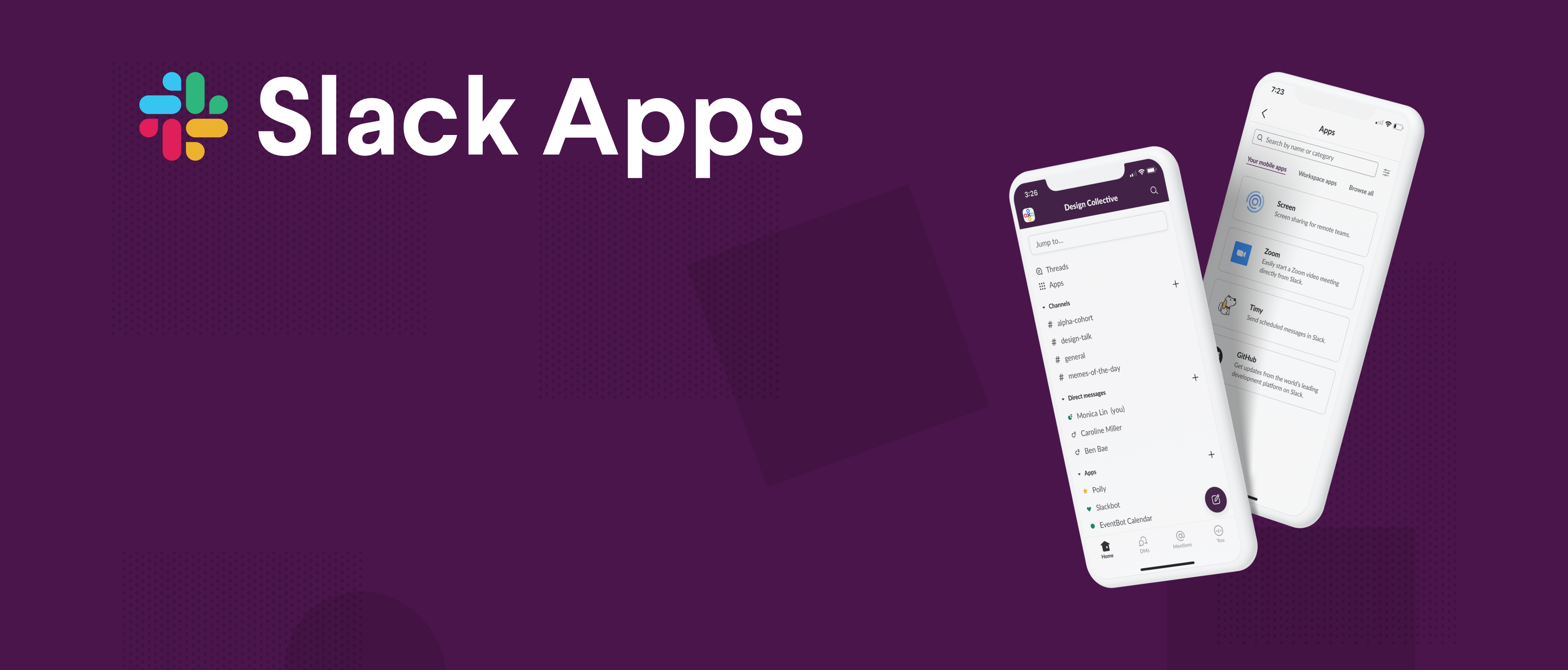
I believe that this would boost time users spend on Slack. Additionally, more and more companies may begin using Slack, seeing that it is truly becoming an all-in-one platform that boosts productivity and smooth experiences for users. (Image from https://slack.com/about.)
Going into this, I actually wanted to add a feature in Slack that would allow users to send voice messages, but I quickly learned that there are actually products available in the Slack Apps directory that, if downloaded, allow users to do just that. Instead, then, I focused my efforts on increasing visibility and interactivity for such features.
Though downloading Apps adds steps to the user flow of accessing extra functionalities on Slack, it increases the number of tools users can implement and allows for customization. I decided to speak to 14 users of Slack, either college students or working professionals, and gained the following insights:
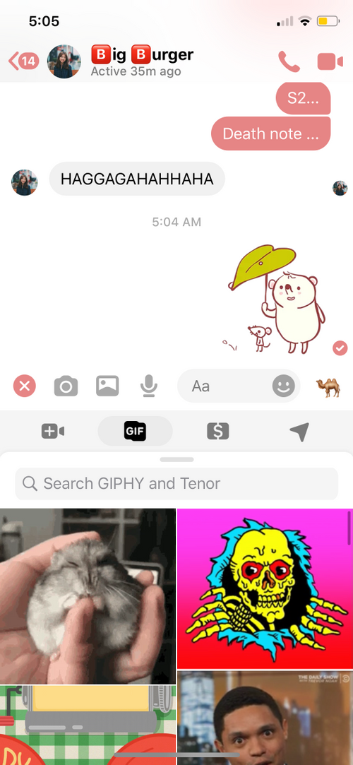
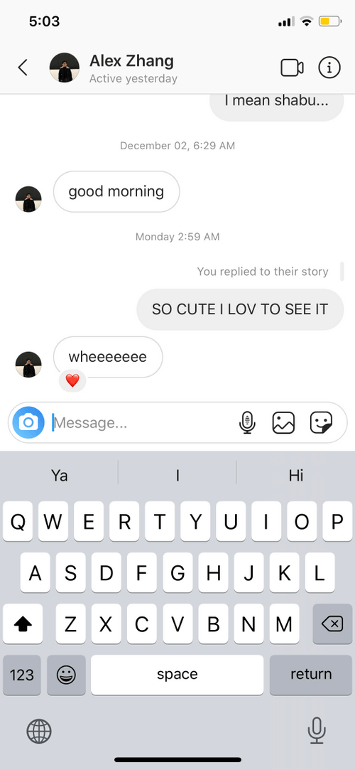
There are not many products out there that offer additional functionalities through the implementation of Apps, but I decided to take a look at how email and messaging platforms supplementary features. Instagram DMs and Facebook Messenger both had very focused features, such as adding images, voice clips, or GIFs. They put all of their functions into a tight space that would reveal more upon further interaction, but this works because everything in that area is focused. Slack may need something more as the added functionalities enhance the productivity experience, not just the messaging experience.
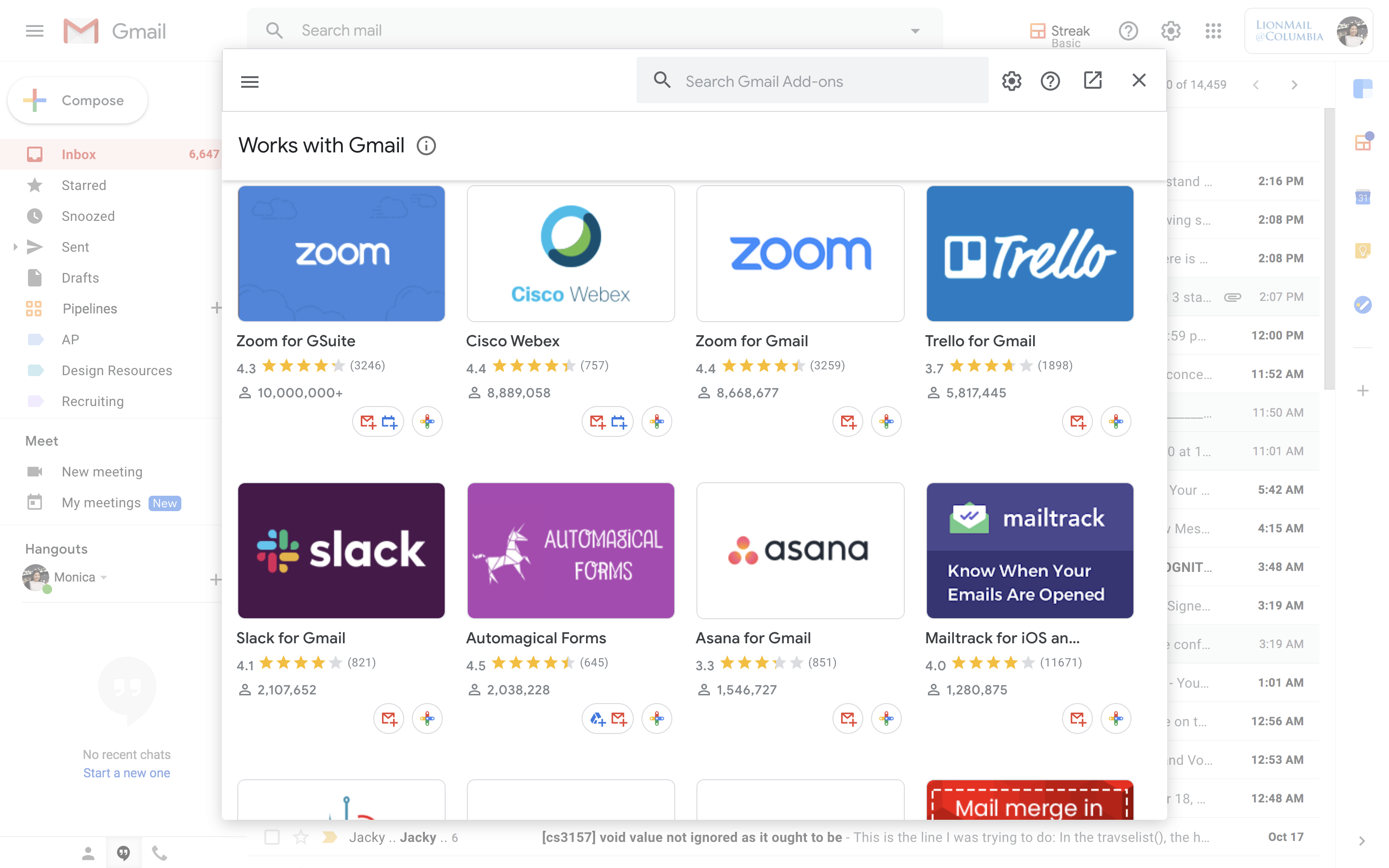
Gmail offers "Add-ons" that enhance user experience as well (Streak, Calendar, Zoom, etc.), but these are only available on desktop. Users can't access these apps at all on mobile, so there's no way to view or add such apps on mobile. Slack allows users to use Apps on mobile, so it would be great to be able to add them, too.
My research showed me that Apps must be quite visible for the user to remember to engage with them. If I wanted to help users boost productivity using Slack Apps, I would need to design a solution that is not only easy to access, but also visible enough to remind users that additional productivity functionalities exist within Slack. Below, I've included a quick summary of the priorities for my design.

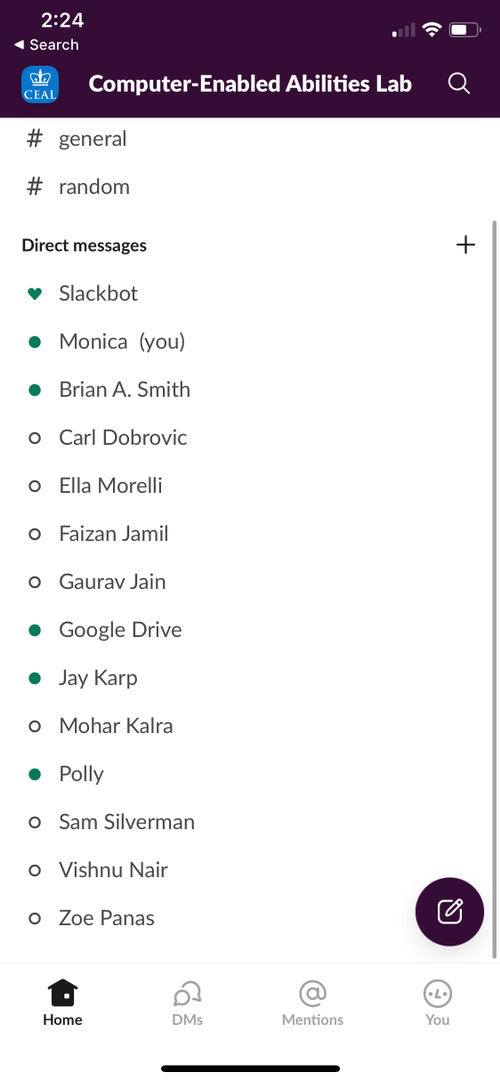
On Slack's current mobile interface, there is no way to download Apps that you haven't already downloaded on desktop. Though you can use Apps in a chat by clicking the lightning bolt icon, there is no clear way of accessing them from the main screen. Chats are sprinkled in Direct Messages, which may cause some confusion and lessen clarity.
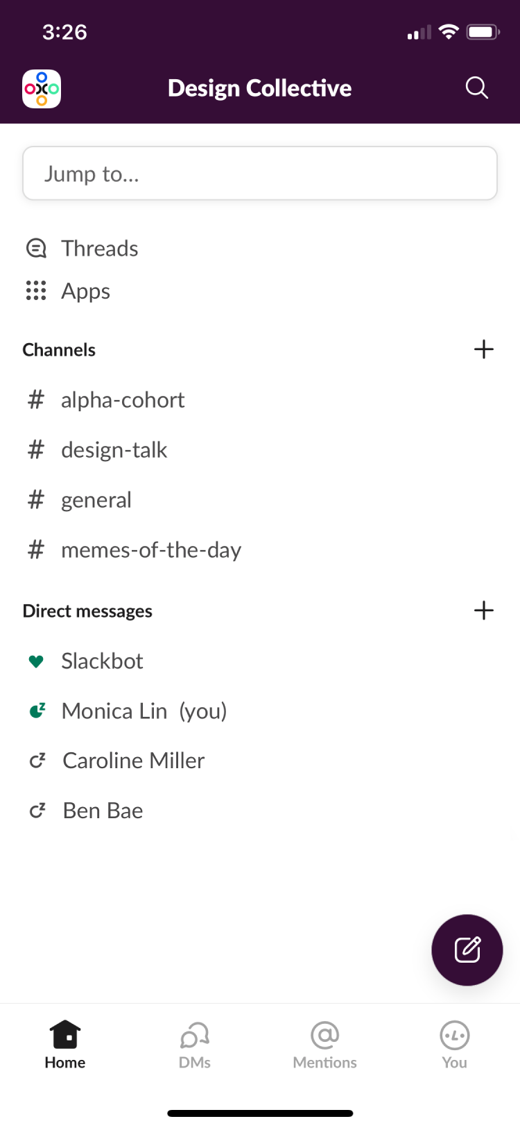
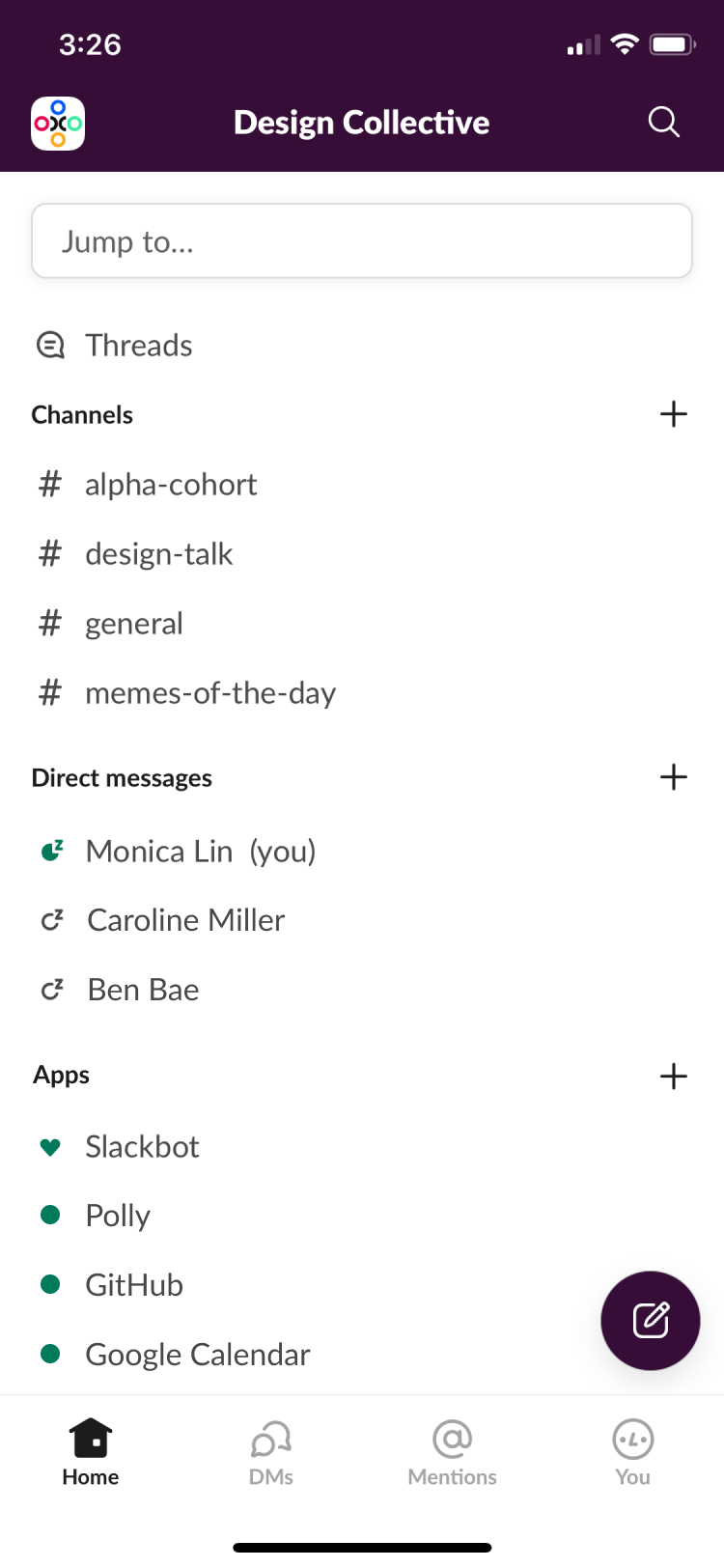
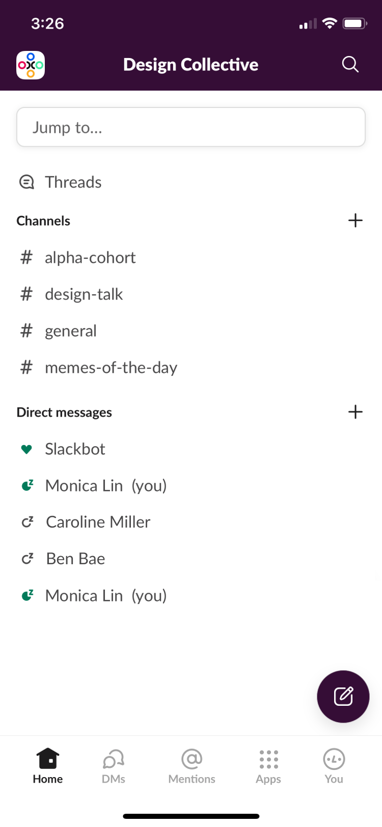
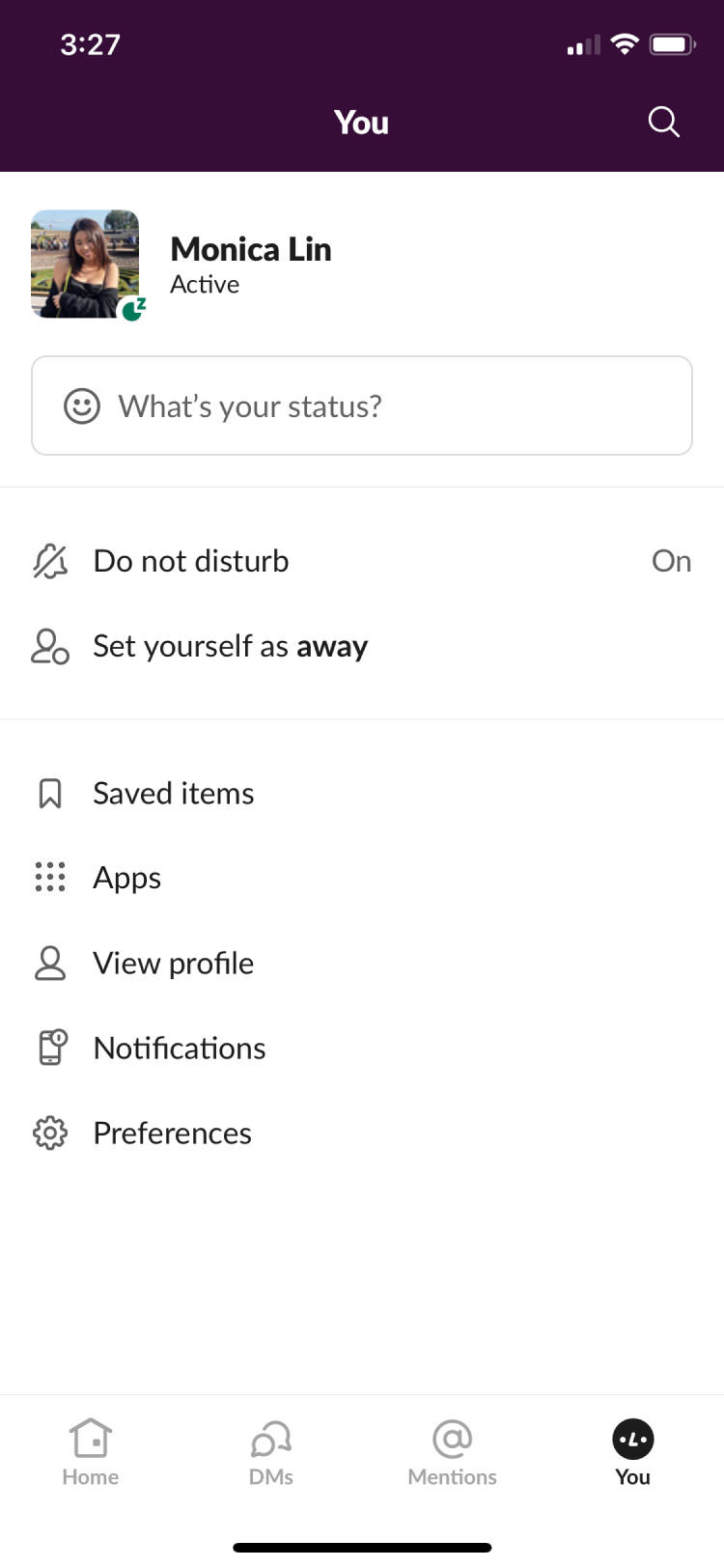
On Slack desktop, clicking on Apps takes you to a your Apps, your workspace's Apps, a search function, and an external link that takes you to Slack's App directory. On mobile, an external link may be a hassle, but more importantly, no page for adding Apps exists yet.
Before moving forward, I needed to decide on a color for the accents. Slack uses a dark green, but I felt that it seemed out of place in some of my mobile designs and perhaps was better suited to the App directory on browser. All 5 of the users I asked about color choice stated that they preferred purple to green, but this meant that I had to change the few green accents in Slack moving forward.


In each of the first three screenshots, there are actually 2 choices to be made: how the overall organizational hierarchy should be presented and the visual design of each App element. In total, that makes 6 possible options.
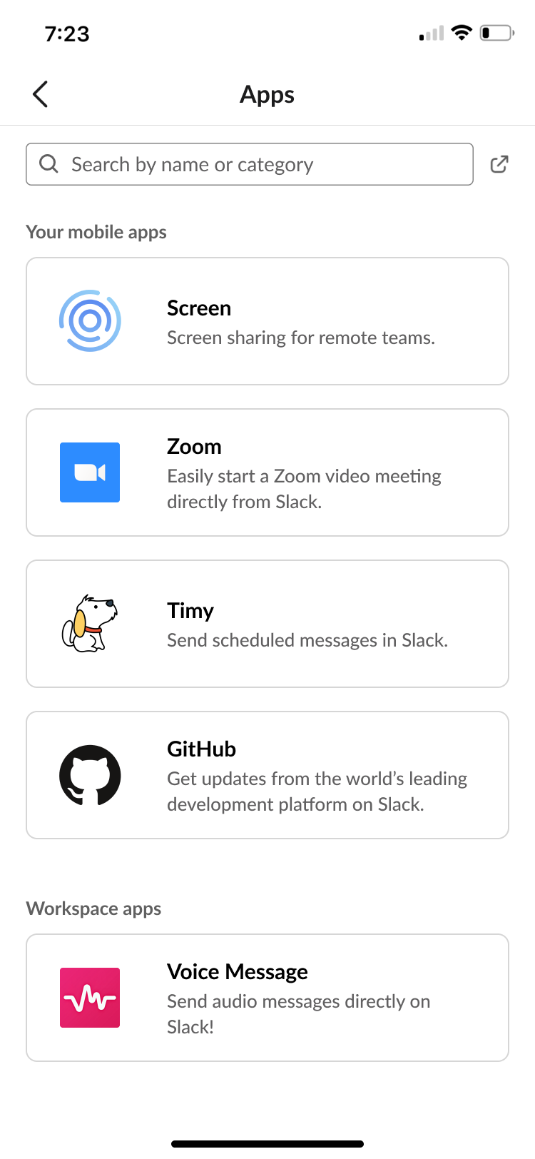
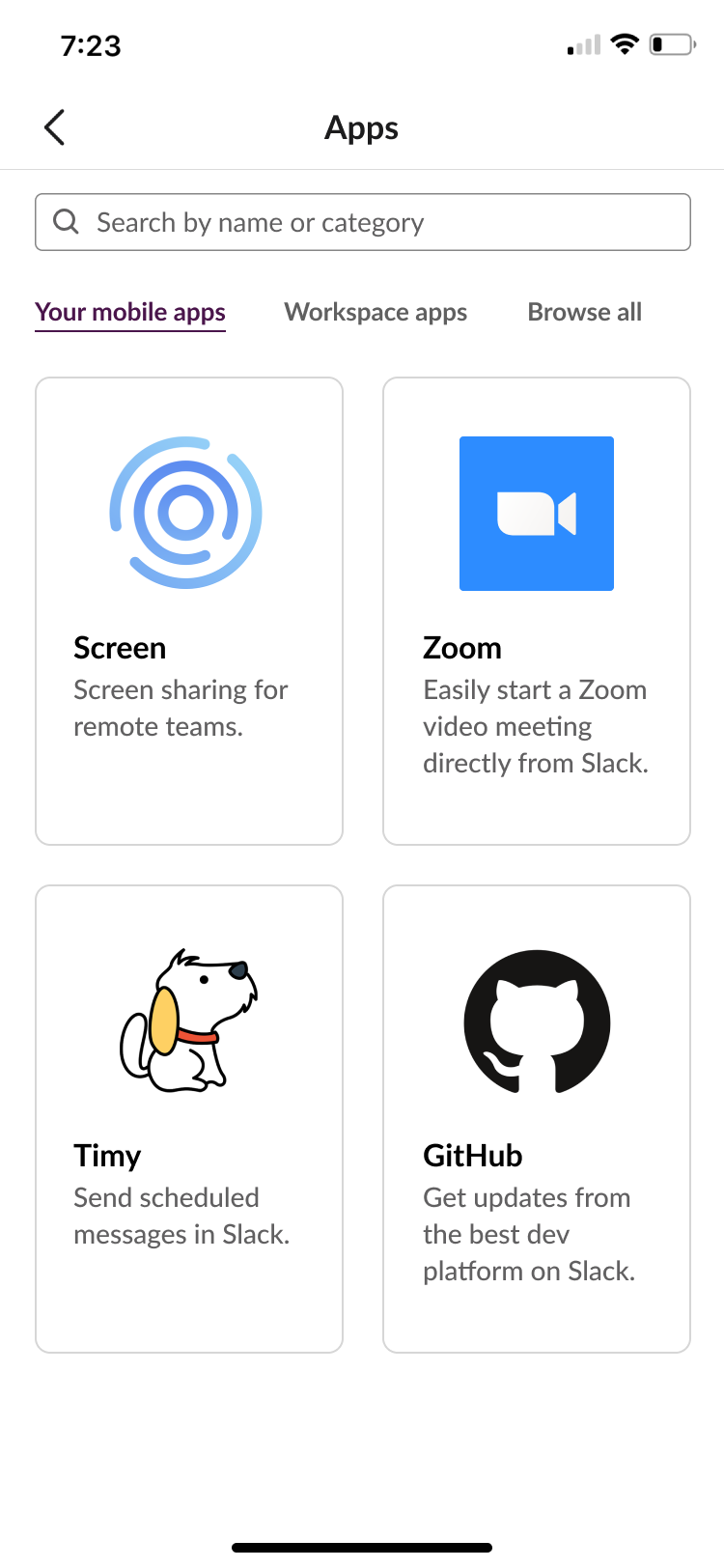
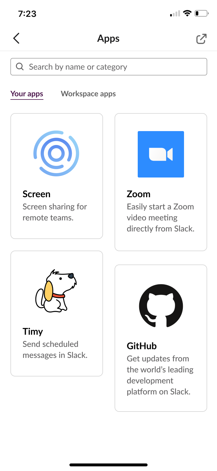
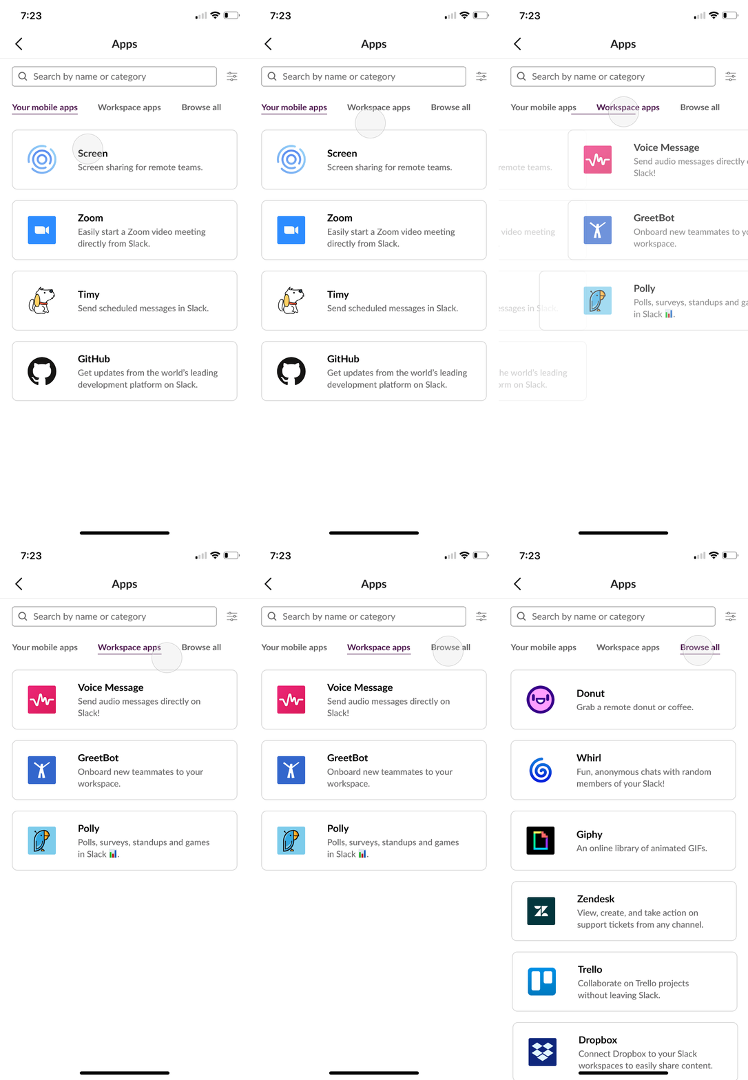
Option 1A was most closely modelled off of what Slack currently has on desktop. I believed that the Apps being all in one page, though, would be too much scrolling, so I came up with different versions. Thus, I created Options 2 and 3 as alternatives with subpages to help organize information. I oped for Option 2 in the end because I believed that a native directory would be most useful.
For the App cards, I actually preferred Option C because it is dynamic and utilizes space much better than Option B. C and B both emphasized the visual element (icon) of an App more, which I thought looked nice but was not communicating the value of an App. After some user feedback, I decided that Option A would be best because it was the most professional and standard design, emphasizing the most useful information.
Next, I needed to design the App details page and the user flow of adding an App to ensure that the experience is as seamless as possible.
Next, I needed to design the App details page and the user flow of adding an App to ensure that the experience is as seamless as possible.
In the end, I chose Option 2 because the main focus of the design was downloading the App rather than visiting its homepage, reading details, or how cute the icon was. Option 1 did not emphasize the actionable items enough, though Slack's desktop version looks quite similar; (the buttons are white.) Option 3 emphasized the wrong content.
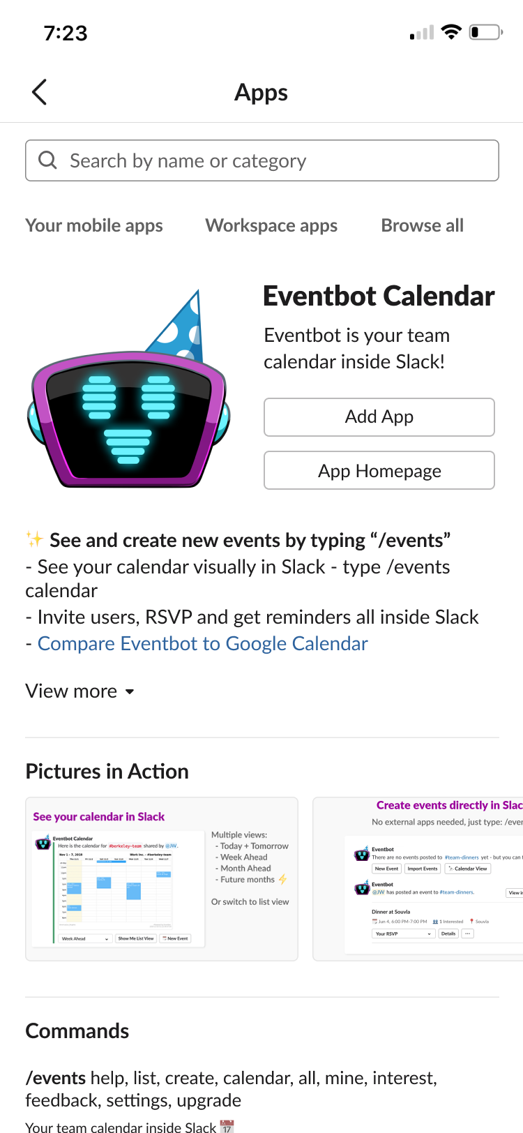
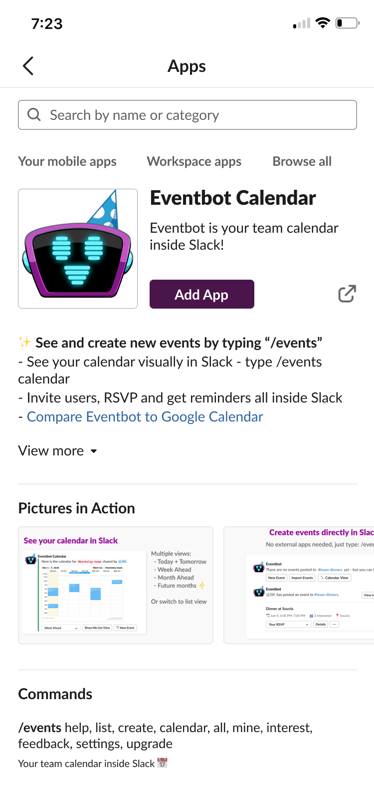
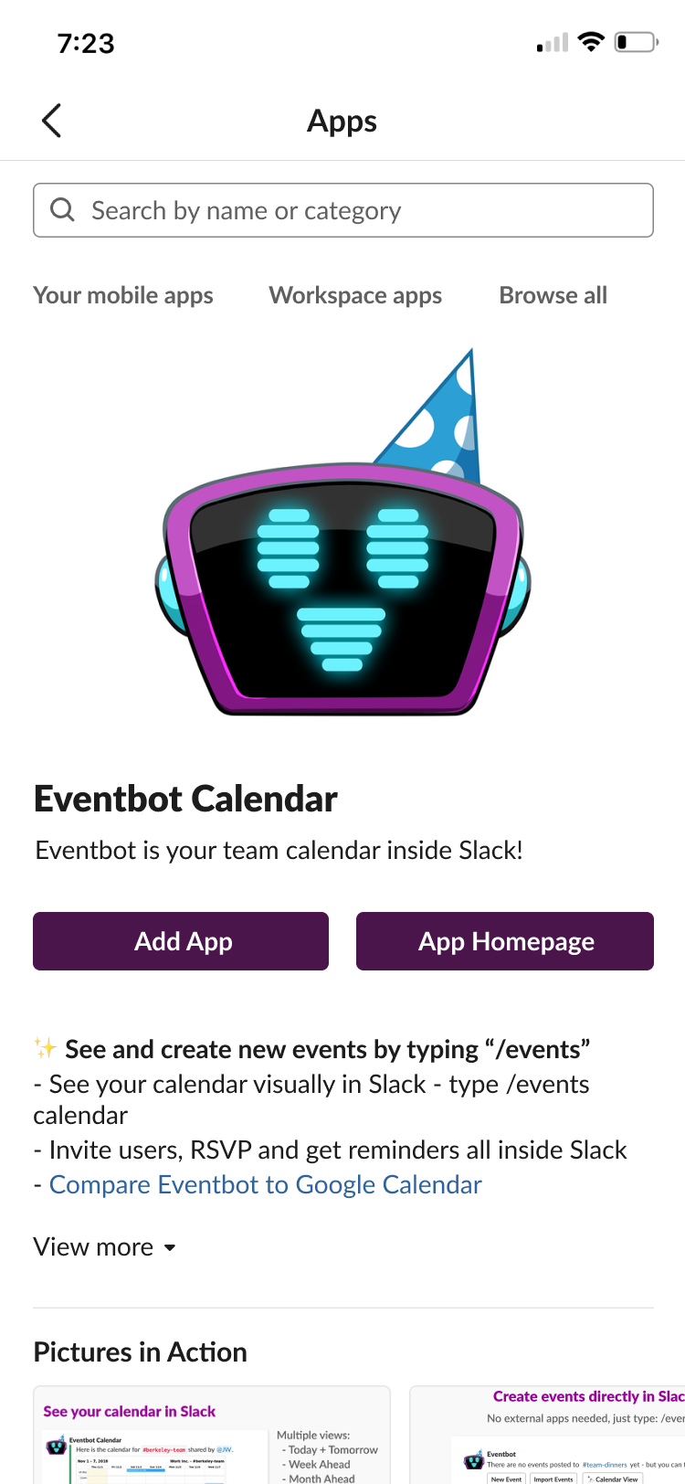
After a user adds an App, what happens?
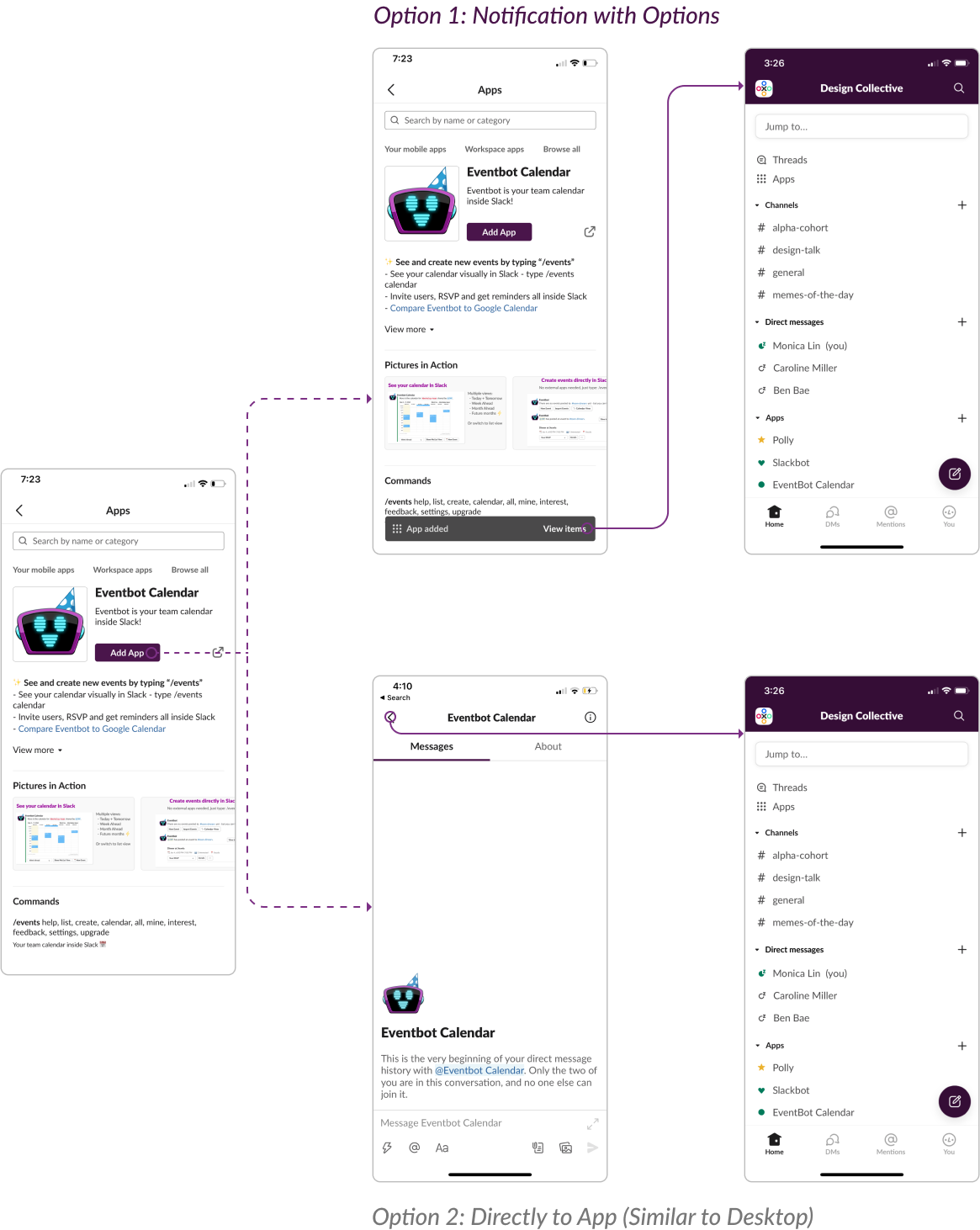
I created two potential user flows for after a user adds an App. Option 1 is inspired by what it looks like when you save an item to a collection on Facebook or an item on Pinterest. It allows for flexibility while alerting the user that they have taken an action. Here, the flow shows that a notification pops up after a user adds an App. When clicked, the user is taken back to the home page where they can access all their Apps.
Option 2 is inspired by what it looks like to add an App on desktop. Slack's flow takes the user from the App details page to a chat with that App, so they can get started using it right away. Here, the flow shows that adding an App takes the user to the chat screen and pressing "back" takes them to their home page.
I preferred Option 1 because I liked the flexibility that it gave users, and many users felt the same. They did not mind the extra taps, even if that would be consistent.
Finally, the last thing left to do was reorganize the home page so that users could access their apps existing Apps and interact with them.
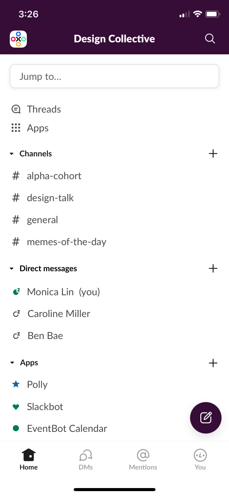
First, I wanted to organize the home page better so that it would be less cluttered. Similar to the desktop version of Slack, I added arrow icons that would allow for the expanding and collapsing of any section. This way, users can navigate through long lists better. Additionally, I wanted to give Apps its own section, mimicking the desktop version as well. (Mobile had Apps and Direct Messages in the same section, which was confusing for users.)
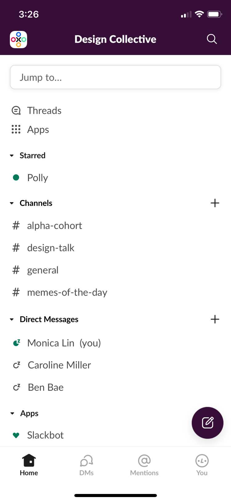
Next, I wanted to organize the information well so that users could easily find their favorite Apps (and DMs or Channels). Option 3 most closely mimics the desktop version of Slack. It shows the "Starred" section as its own. Though items would clearly be prioiritized and easily found, there is not much differentiation between a Direct Message and an App. Moreover, all "Starred" items do not have the same importance. Just because an App is favorited does not make it as important as a Channel.
I decided to move the "Starred" items to the top of their respective sections. This way, items could be organized by their type but still be easy to find. Additionally, Slack uses blue for their stars, but I believe that yellow would be better as yellow is mor standard. The difference between blue and green is also rather slight, and many users had trouble differentiating the two, even though the star is a different shape.

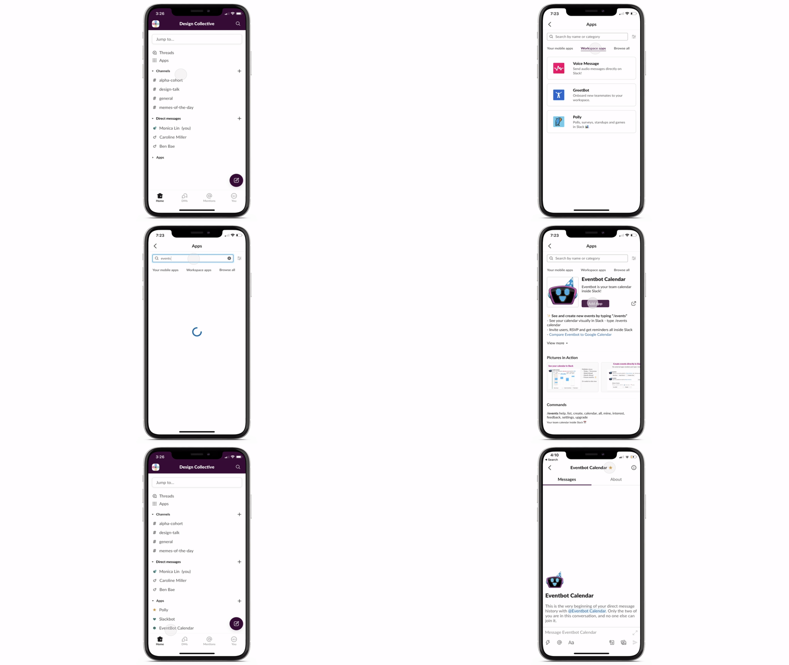
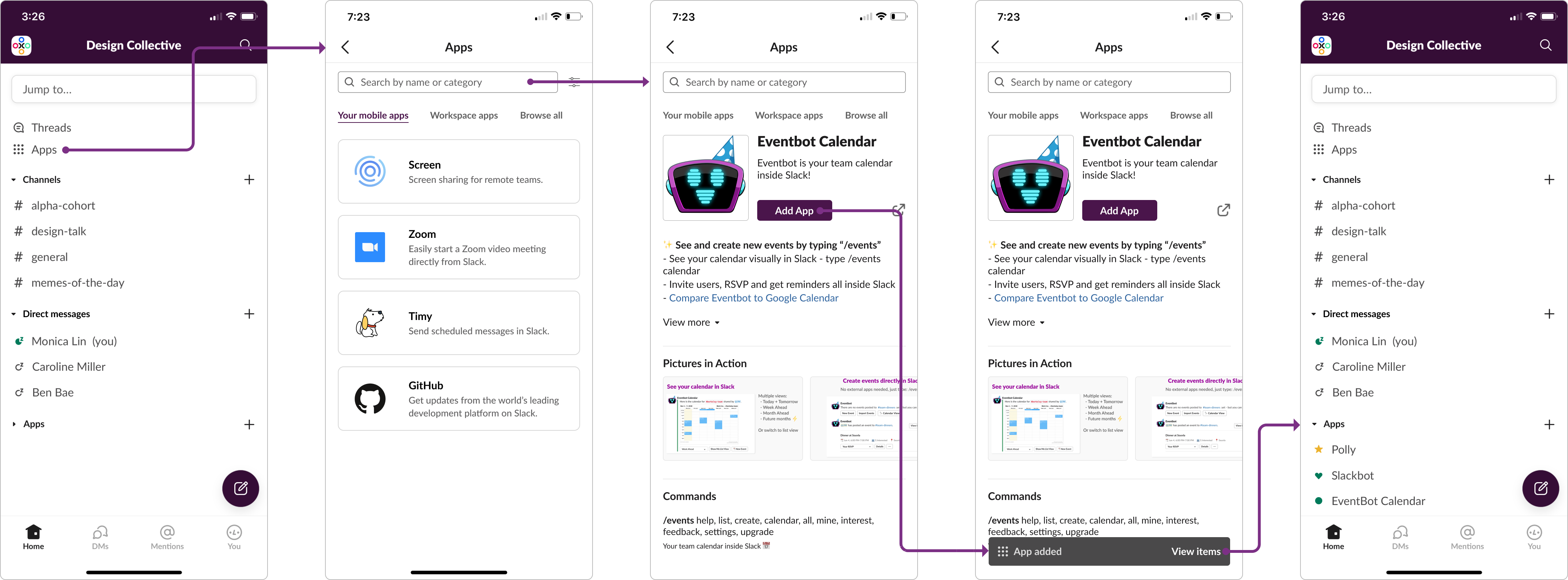
From home screen to Apps and back, below is a quick summary of the user flow!
Lastly, I used Principle to bring my final design to life.

This past month, I went to a couple of design workshops, and they all emphasized the importance of backing your design decisions thoroughly. A Facebook Portfolio Review I attended especially emphasized how important it is to pick a single design from a set of iterations, so I tried to exercise that here. This case study taught me to be a lot more confident in my own design decisions and intuition as well as incorporating user feedback and testing throughout the entire process.
I would like to explore how users could delete Apps from the home screen or if there is another entry point, besides the lightning bolt, that makes it easy for users to use Apps while in a chat. I would also like to explore how useful ratings would be for Apps. Though ratings can give useful information, sometimes, they aren't truly reflective of an app's potential, but this may be another way to get Slack users to further engage with their product.
Lastly, I would love to see how my product would actually affect business metrics, such as minutes spent on Slack or how many other companies would make the switch to use Slack as their main communication platform with the additional functionalities!