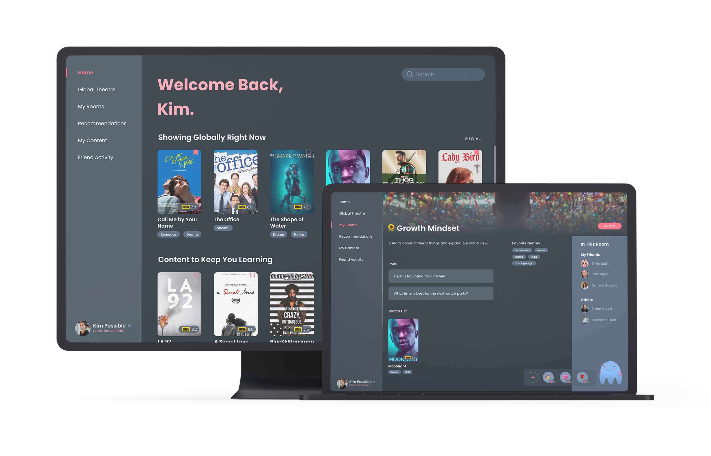
An entry for the Adobe + Netflix Creative Jam that placed 23rd out of 600+ teams (2,300+ students.)
For this competition, we were tasked with creating a third-party website that would bring people closer together when streaming. My partner and I decided to create a platform allowing users to simulate in-person viewing experiences while also capitalizing on activities you can only do online. Some features of Gazer include: creating private rooms, discovering content related to learning goals, and reacting to and saving specific moments and scenes.
WHO
A team of 2, including myself.
WHEN
June 22 (11:00 AM PST) to June 24, 2020 (10:00 AM PST).
HOW
Interviews, Competitive Research, Wireframing (Figma), Prototyping (Adobe XD)
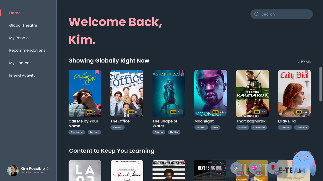
Users can join suggested theatres and view movies via their dashboard. Each movie its tagged with categories, ratings, and a bookmark. Alex, Gazer's virtual assistant, can help simplify room creation and navigation.
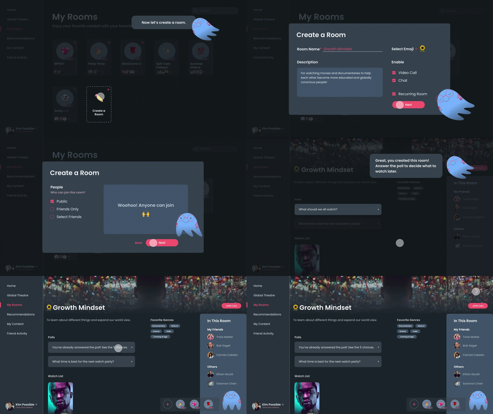
Users can customize rooms with emojis and decriptions and invite their friends to join. Moreover, Alex can help users schedule streaming times! (This demo is from the tour.)
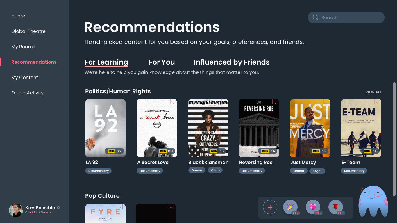
The first thing that appears in a user's recommendations is content that matches their "learning goals." We wanted to help users stay educated regarding topics they are interested in.
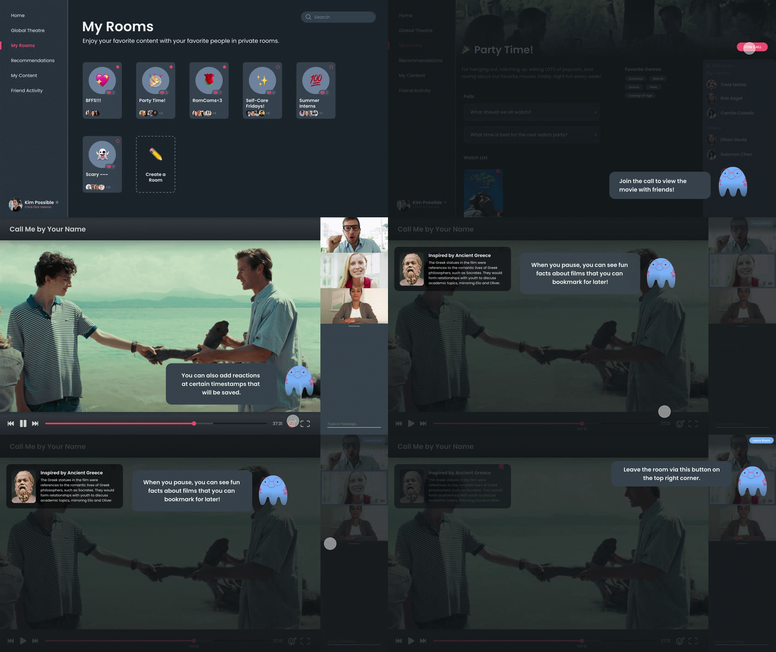
Users can view content with others while videochatting and messaging. They can also save interesting facts and react with emojis to scenes that make them feel emotional.

When users react to certain scenes, they will be saved as "Moments" and organized by emojis. Hovering over each scene plays it.
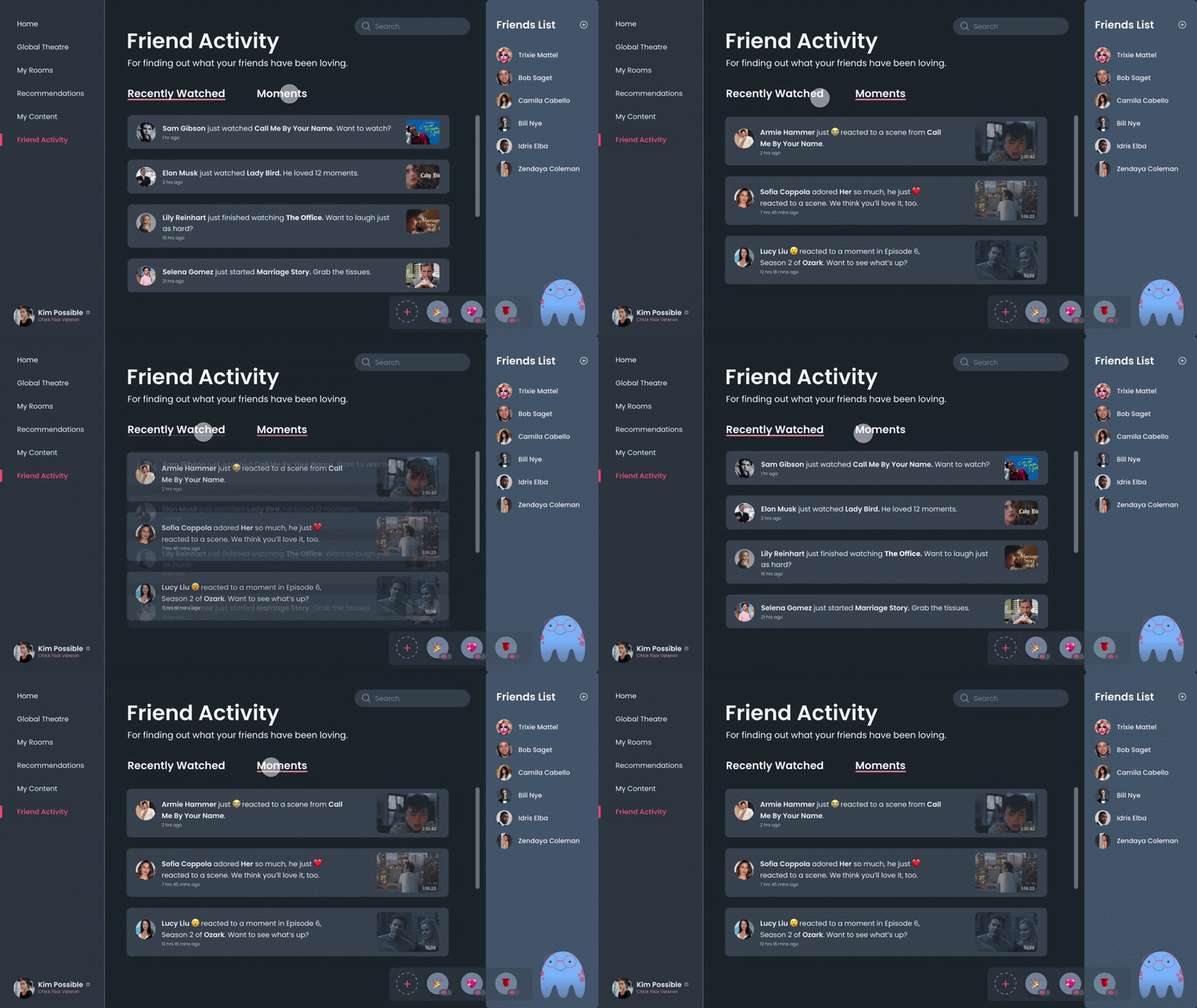
Users can see what their friends are up to via "Friend Activity." Users can click on a friends' recent watches, saves, and reactions/moments to be taken to that movie, show, or scene.
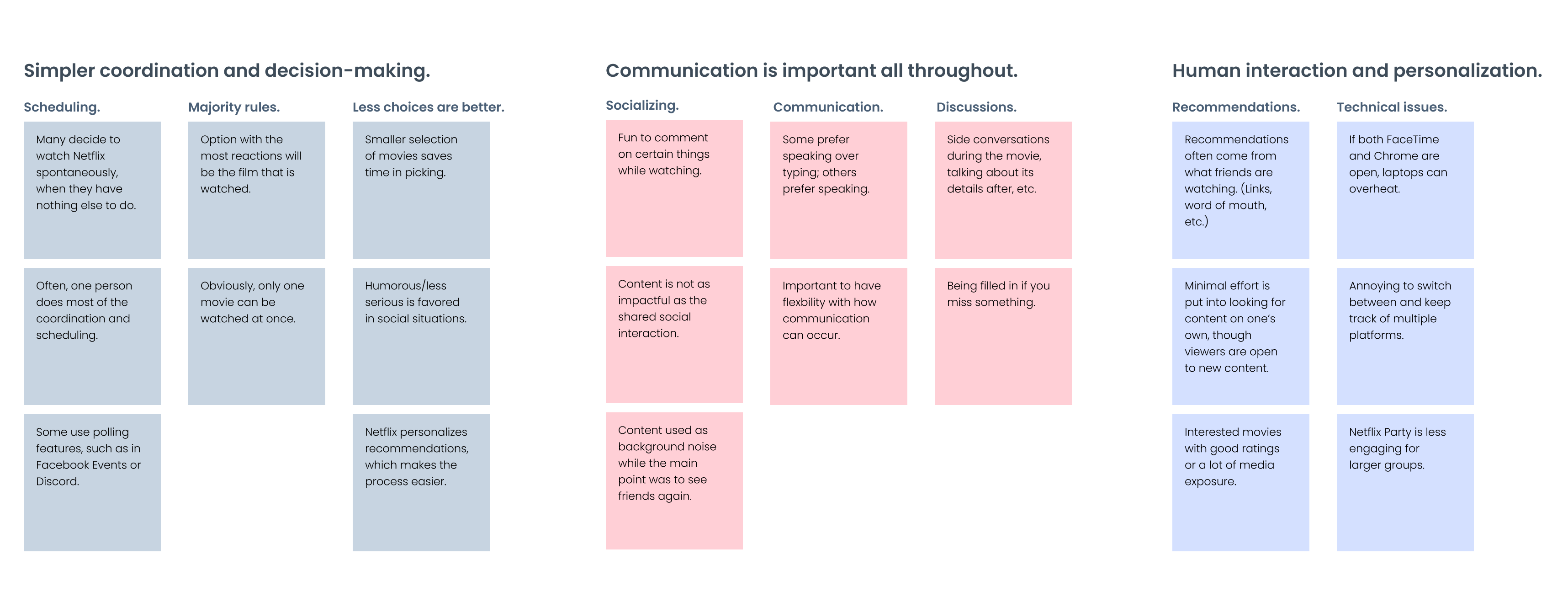
We conducted quick interviews with 6 people to ask about their social viewing experiences. We identifed a couple of pain points:
We created an affinity map to see trends in experiences. We found that at the time, there was not a good platform that synced streaming experiences. (This was before many "Watch Party" features came out.) Also, users liked streaming more for the social interactions than just watching the movie or show (most of the time.)
We researched the UI/UX of 12 "similar" applications. Below are a few summaries.
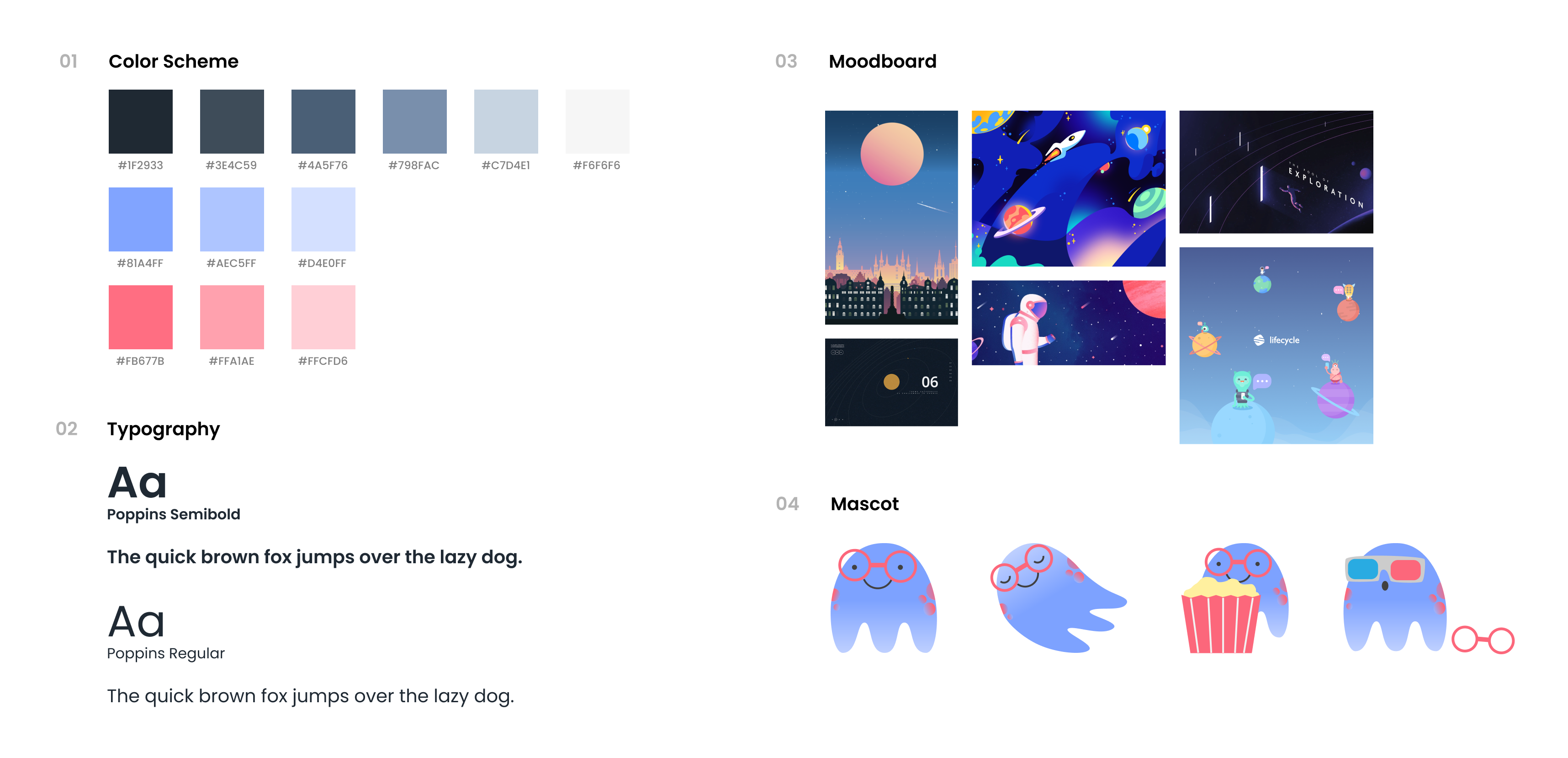
Before moving forward, we decided that our application would include users of all ages and demographics, though the design would be a bit more modern and hip. Some features may also seem like they are better suited for younger audiences, but they are not discriminatory towards older ones at all.
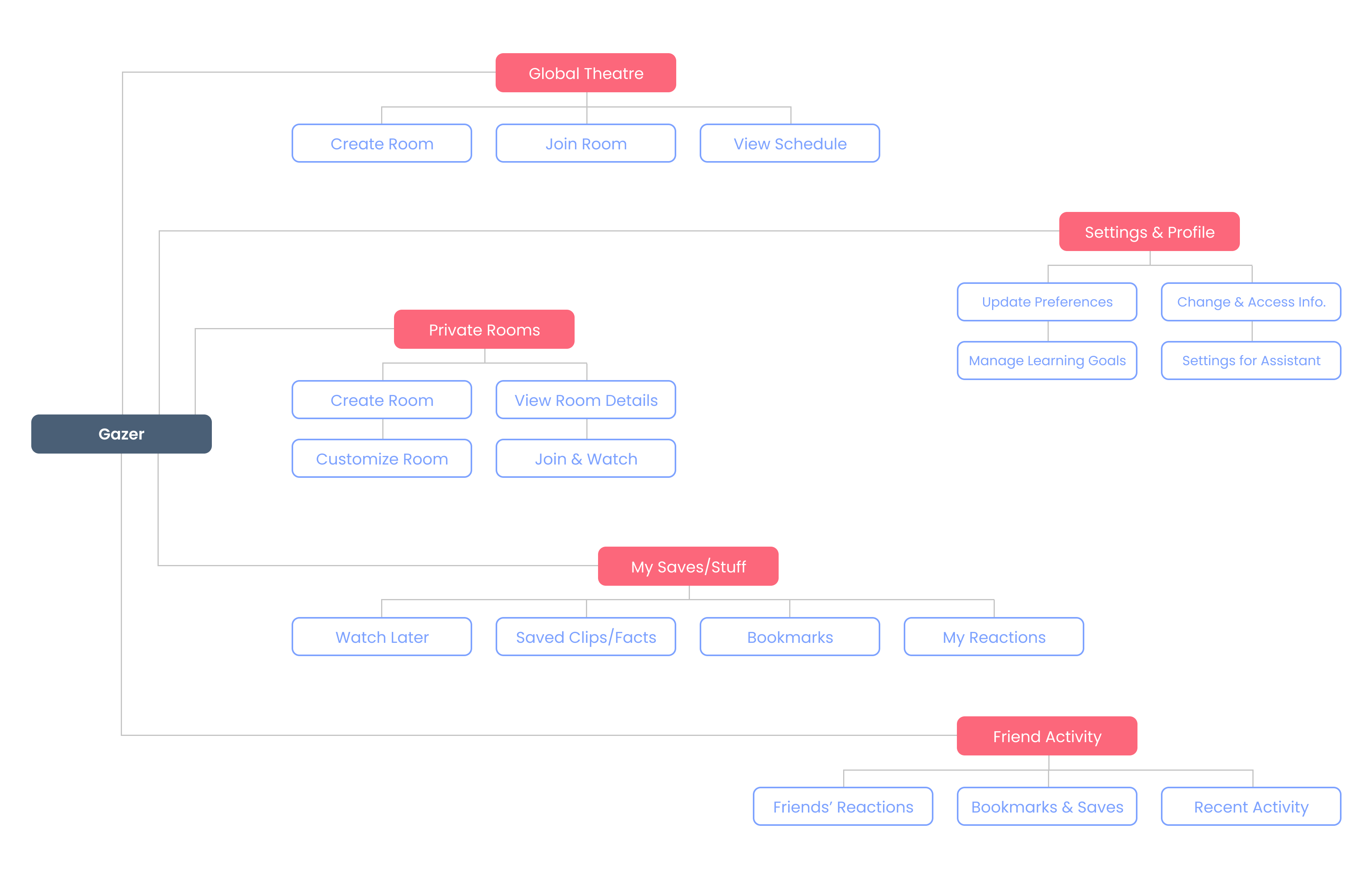
Next, we solidified the features of our application. The information architecture diagram below ties all of the features together and gives a glimpse into Gazer's user flow. On Gazer, the user would create an account then go through an onboarding process, aided by Alex, to choose their favorite genres and desired learning goals.
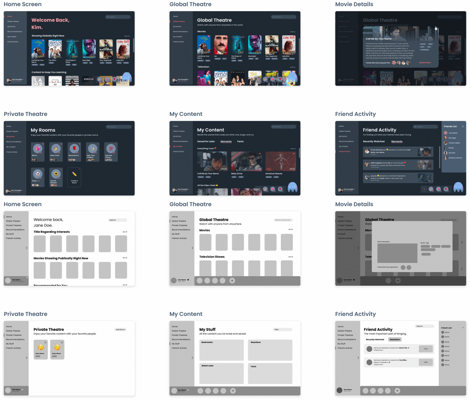
From low-fidelity to high-fidelity, we wireframed with the user flow in mind.
It was difficult to go through as much of the design process as possible within 30 hours.
(I think that I hardly slept throughout the course of this design challenge.) We needed to consider how to
optimize a design that not only the judges could follow well but also could stand well alone.
(In this case, our tour was much too long for a regular user, but perhaps useful for the judges.)
Another difficulty
was that I actually worked with someone who had a very different design style than I did. She did not emphasize perfecting each
pixel's position as much, and I was unused to using components in Adobe XD. It was hard to get used to at first,
but eventually, we meshed well and were able to finish our product.
Next time, I would like to leave an hour or two for fine-tuning the prototype. My group tested the prototype to see if everything was working properly, but we did not have enough time to add more intricate interactions.