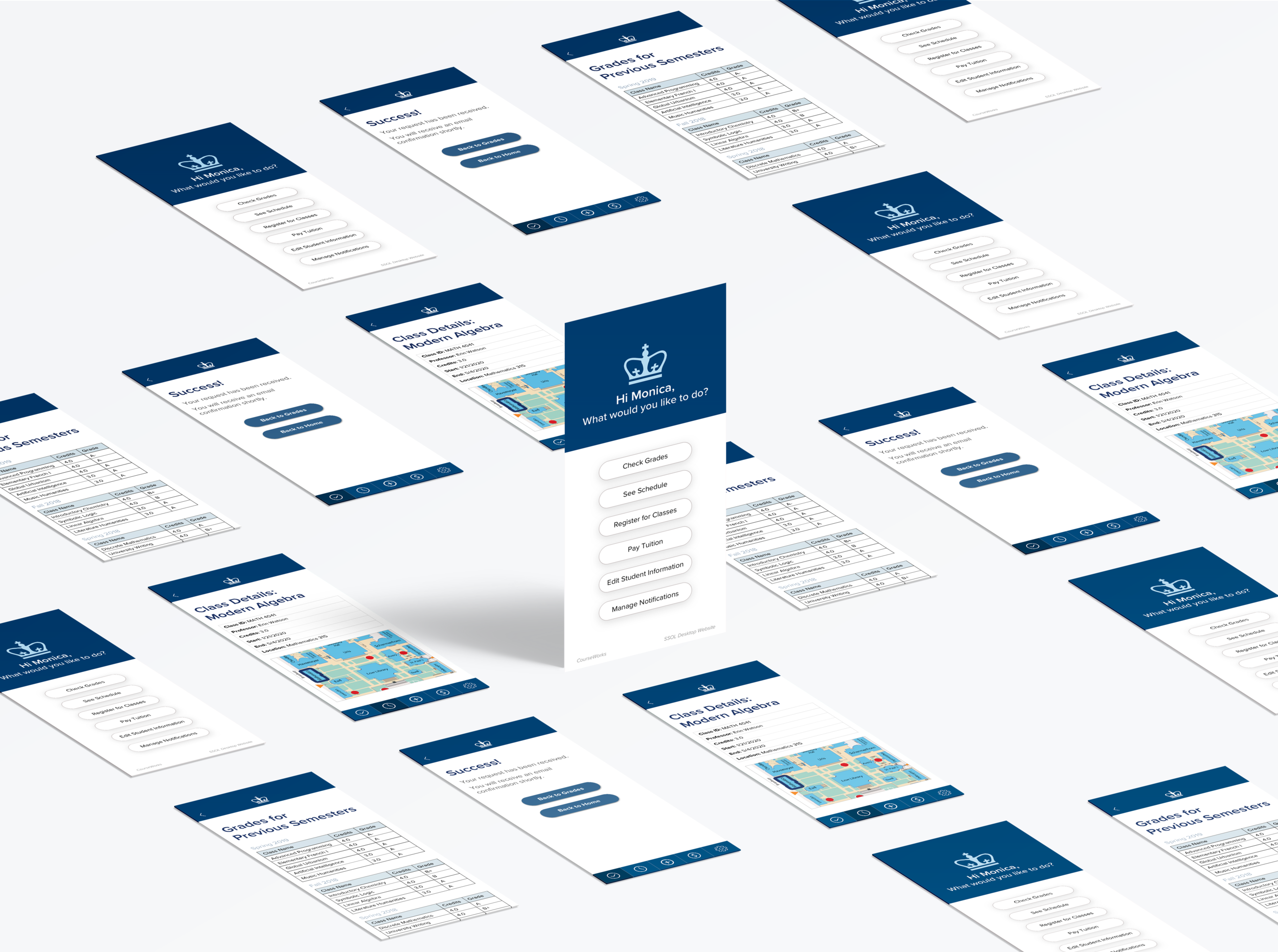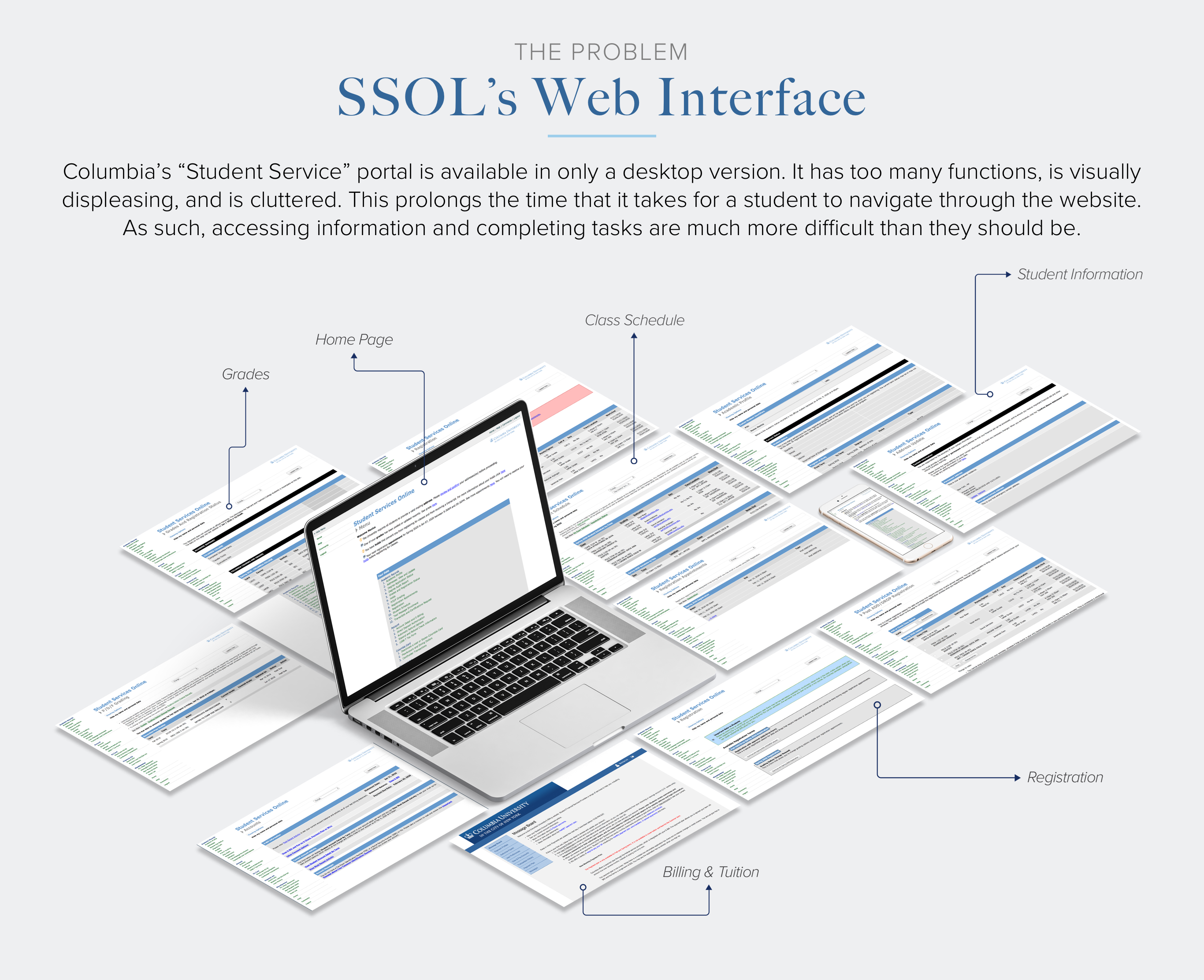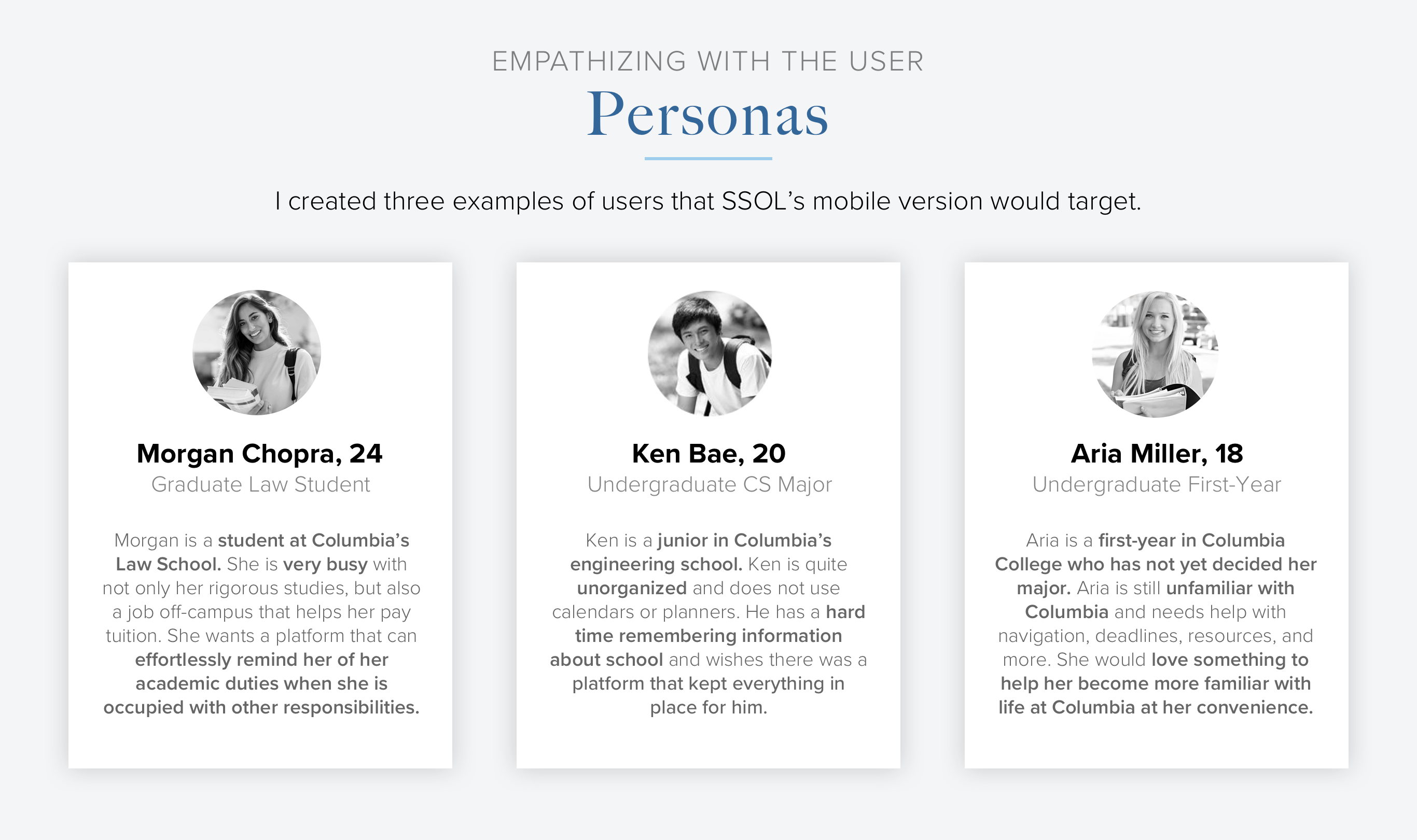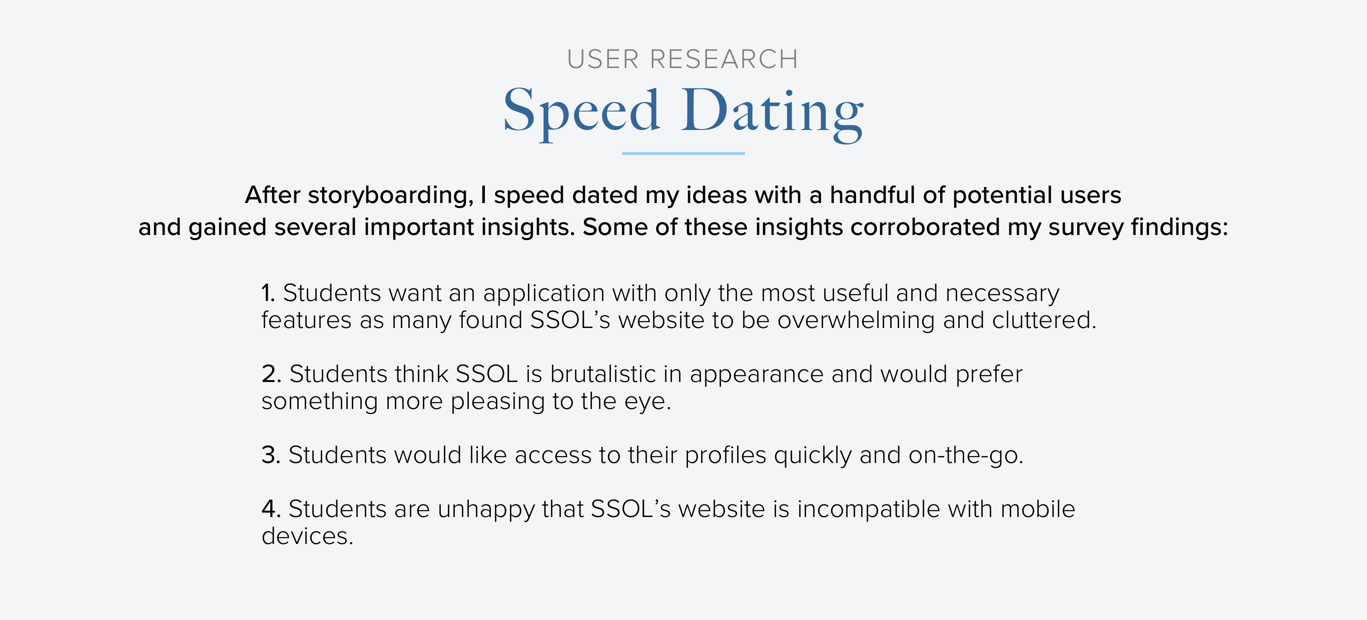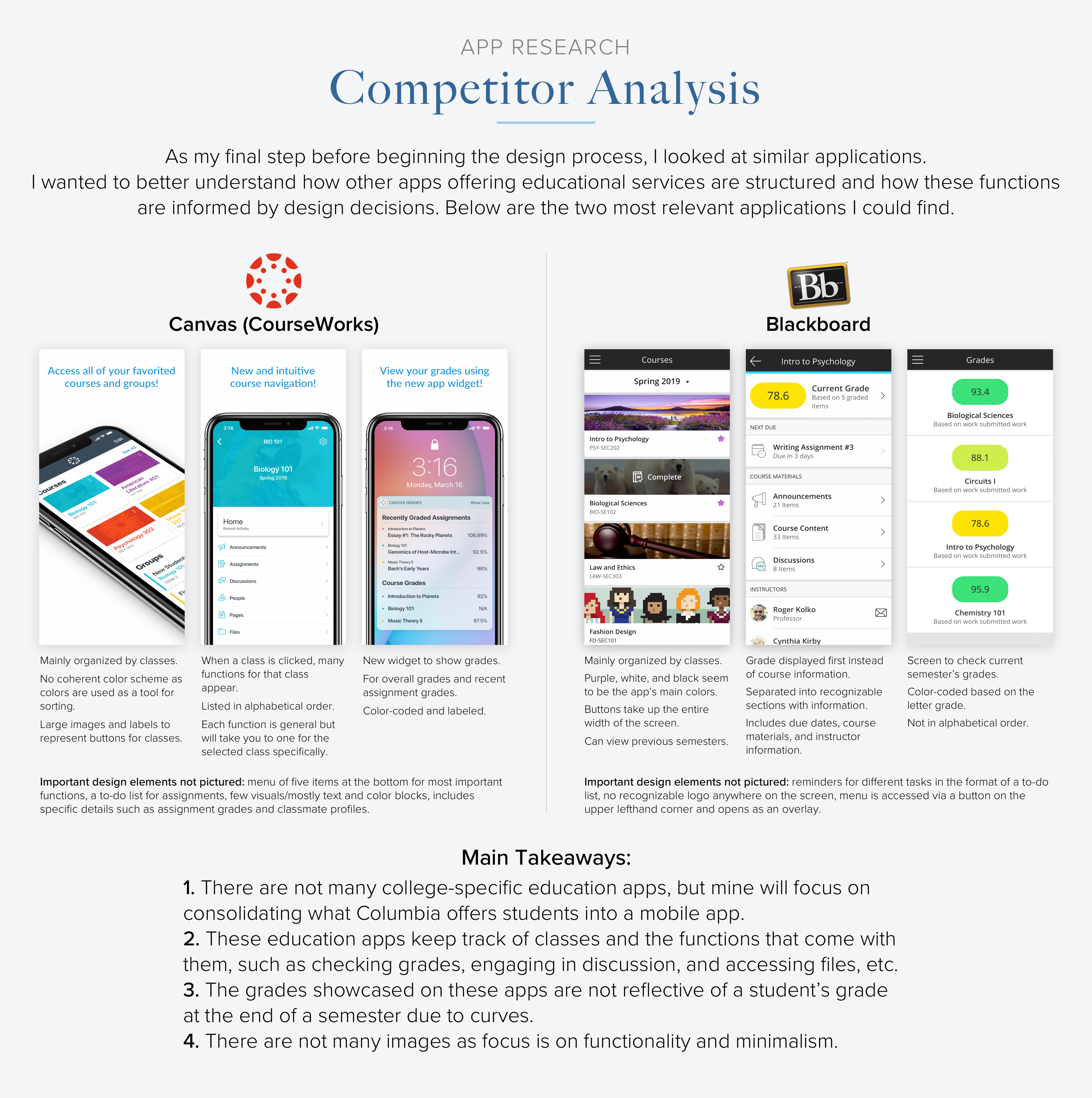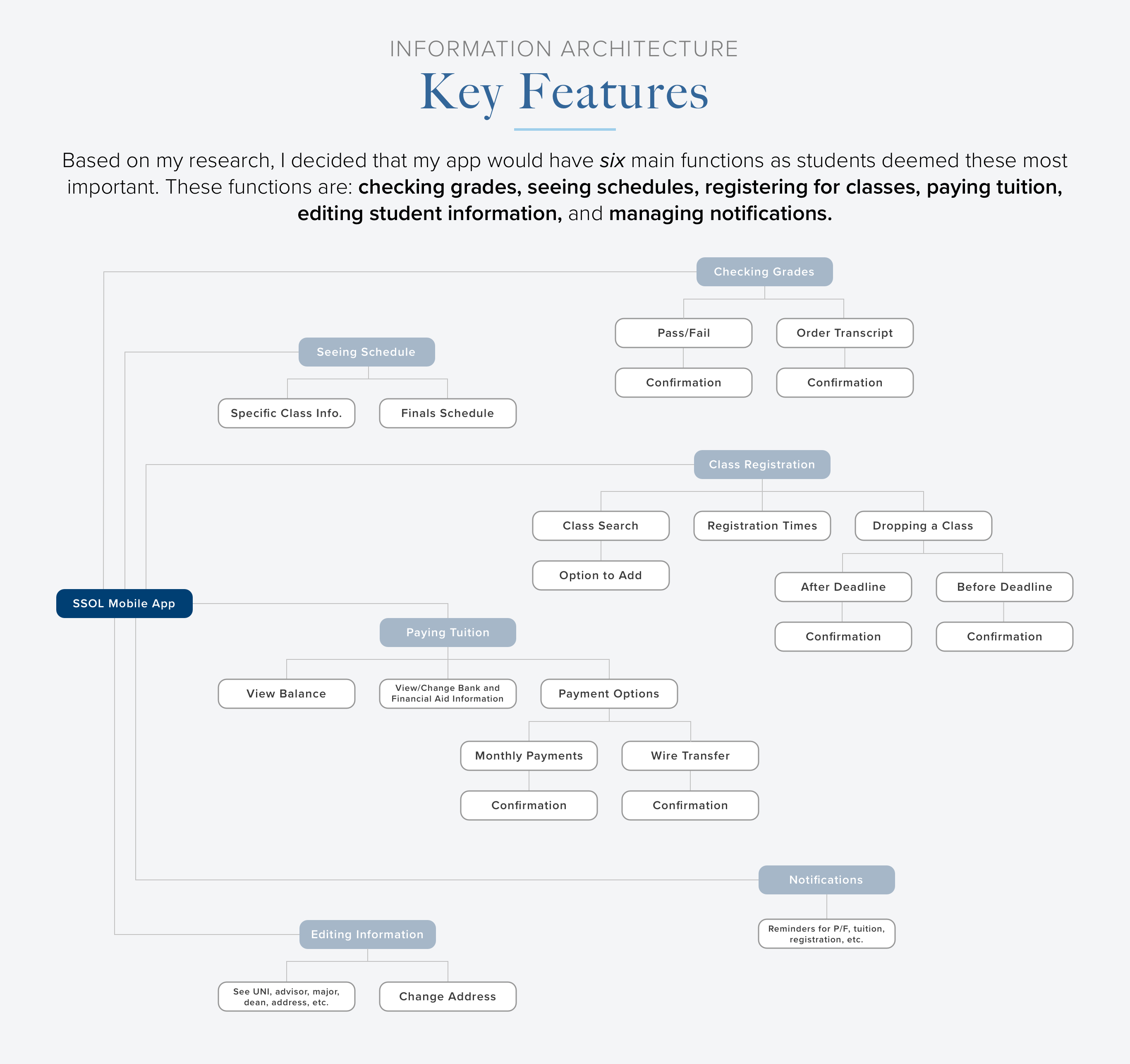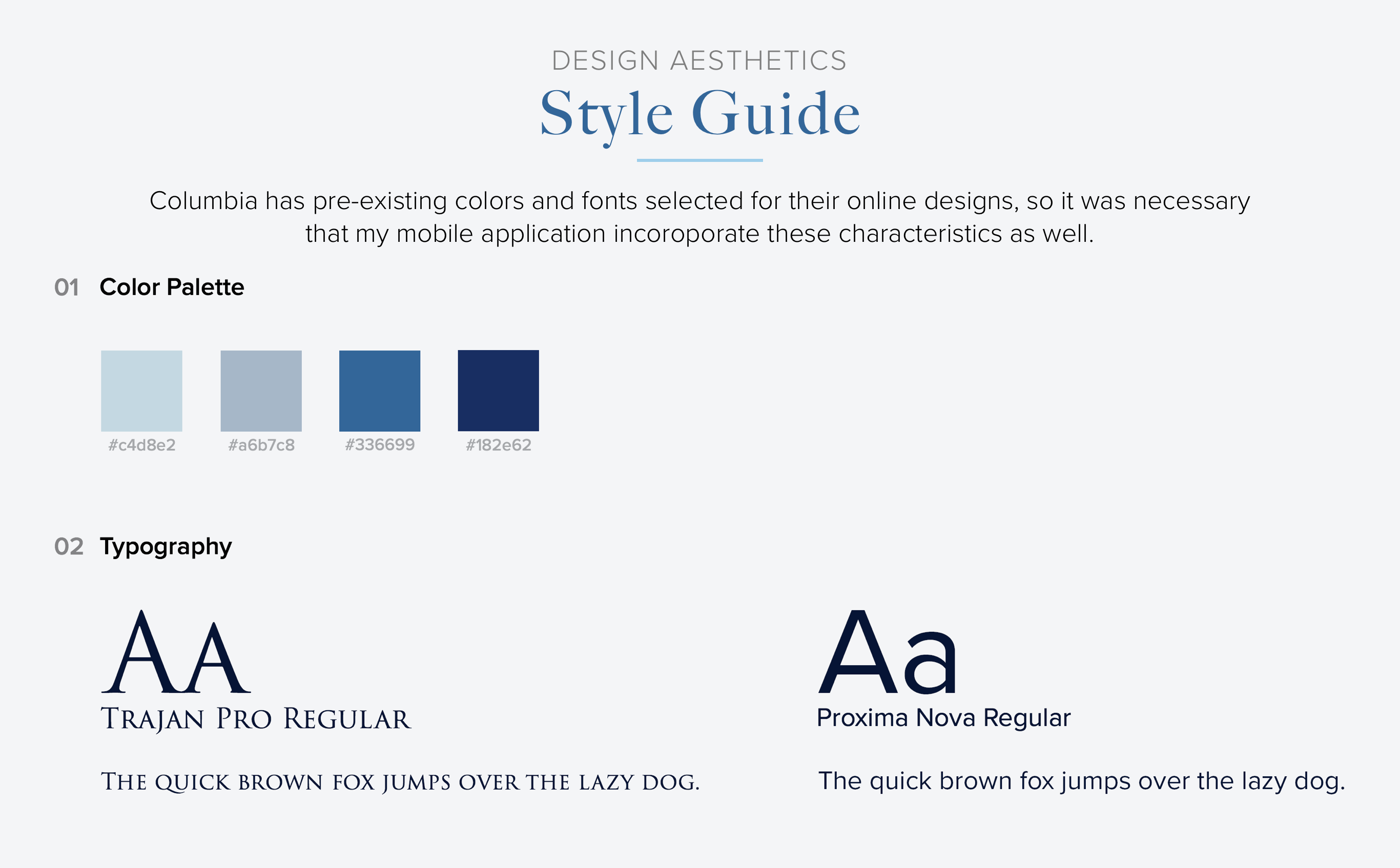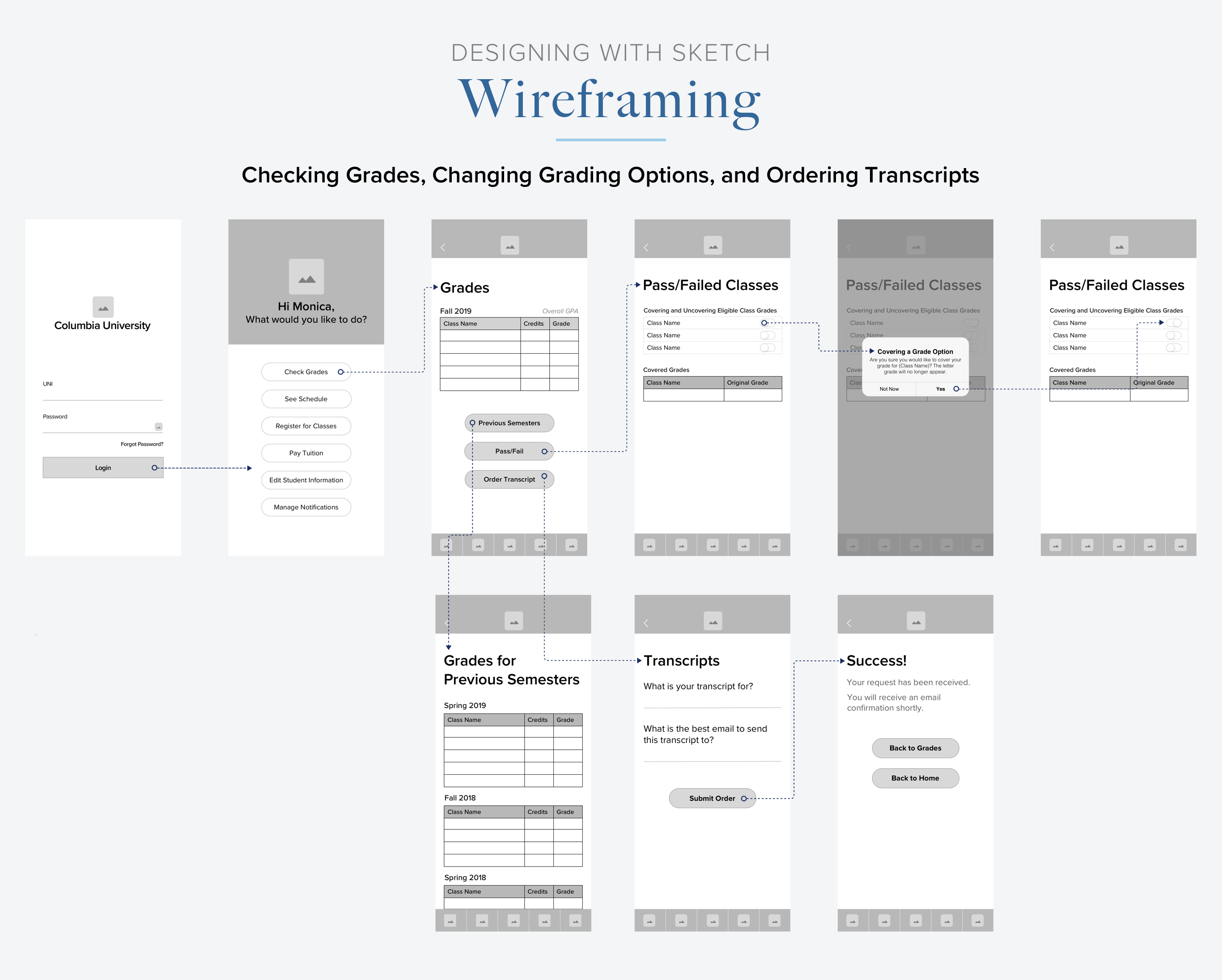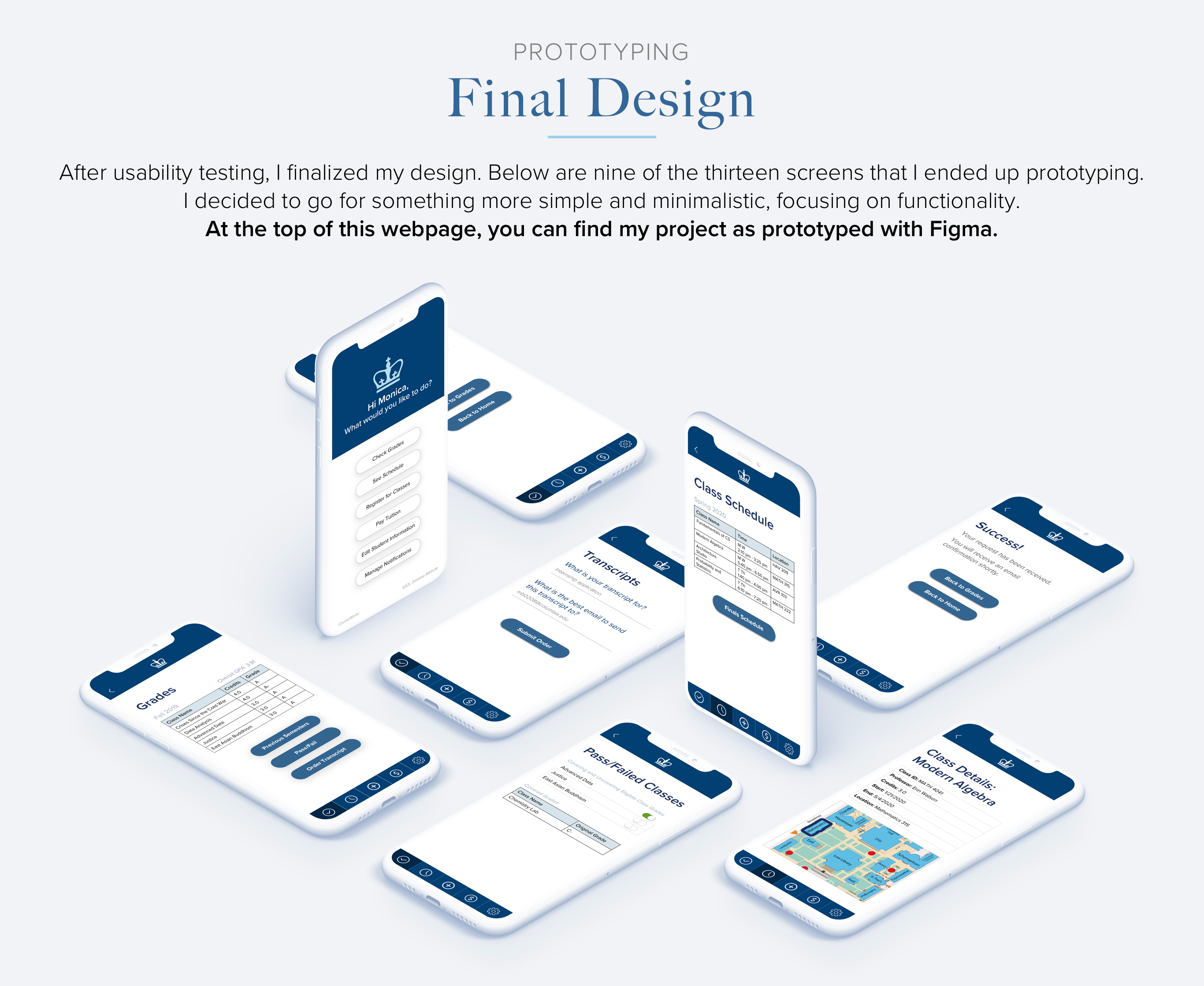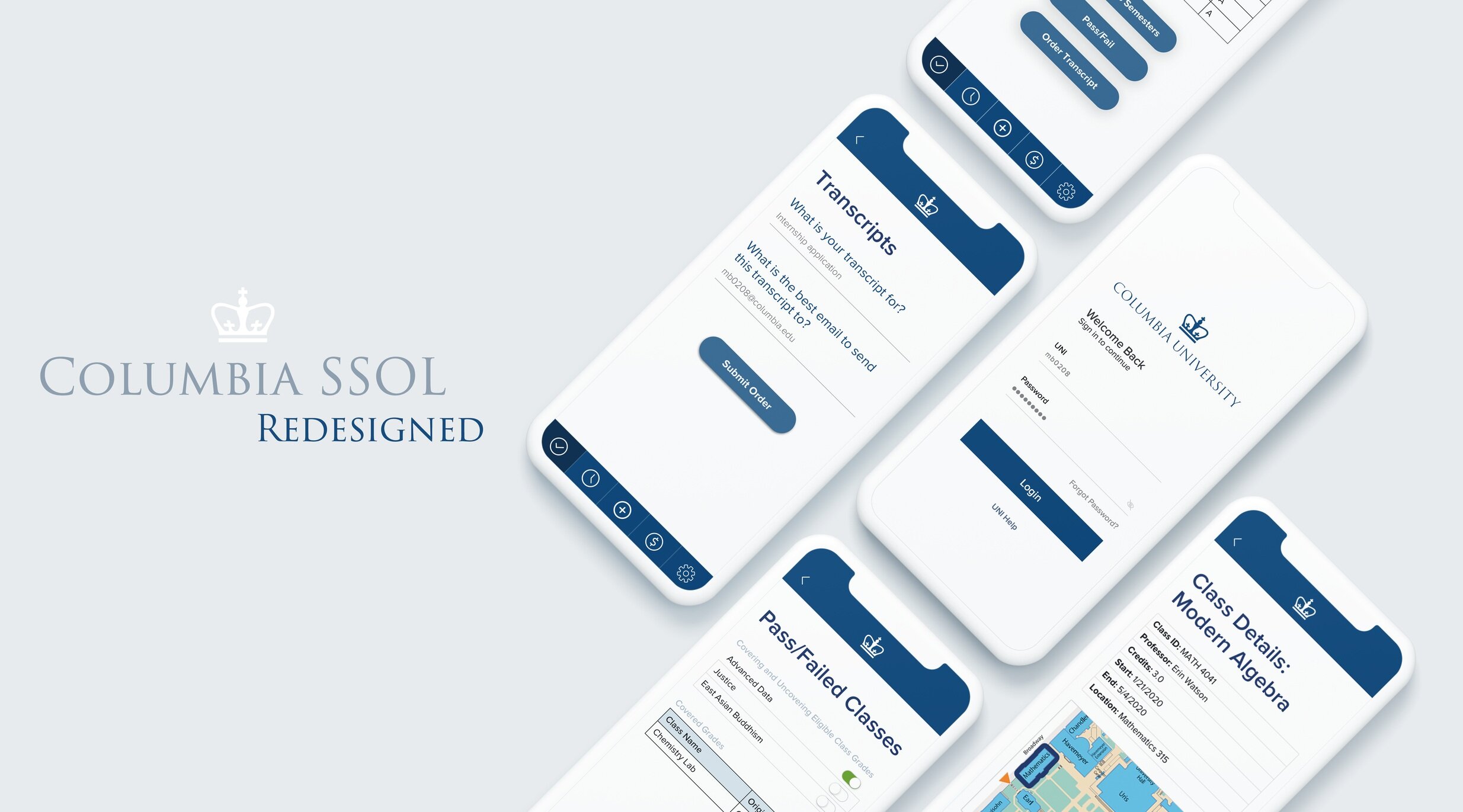
The objective of this project was to create a mobile application that completely redesigned SSOL’s web interface. SSOL is cluttered, difficult to look at, and hard to navigate. As such, I designed a clean app that not only makes user flow more intuitive, but also enhances the aesthetics of the interface. Fast and efficient, it prioritizes what students need most.
WHAT: UI/UX Exploration and App Development
HOW: Research, Ideation, Storyboarding, Wireframing (Sketch), Prototyping (Figma)
WHEN: January 2020 to Present

Created using Figma, this interactive mockup was meant to show the application’s features and communicate the mission of SSOL’s mobile redesign.
Not every feature is displayed (only “Check Grades” and “See Schedule”), but all actions in the app will have a similar user flow and minimalistic design as it is meant to be utilitarian and straightforward.

