
As an intern at Cress Health, I designed a data analytics dashboard that helps clinics and HR teams track the stress, health, and burnout of their nurses and doctors. Such a tool would help them understand exactly what their teams needed, so they could take actionable items to alleviate problem areas. In the end, we were able to deliver a dashboard that increased the number of clinics signed up for our launch by 66.7%!
WHO
Another intern and I were overseen by two managers.
WHEN
May 15 to September 2, 2020. Roughly 14 weeks.
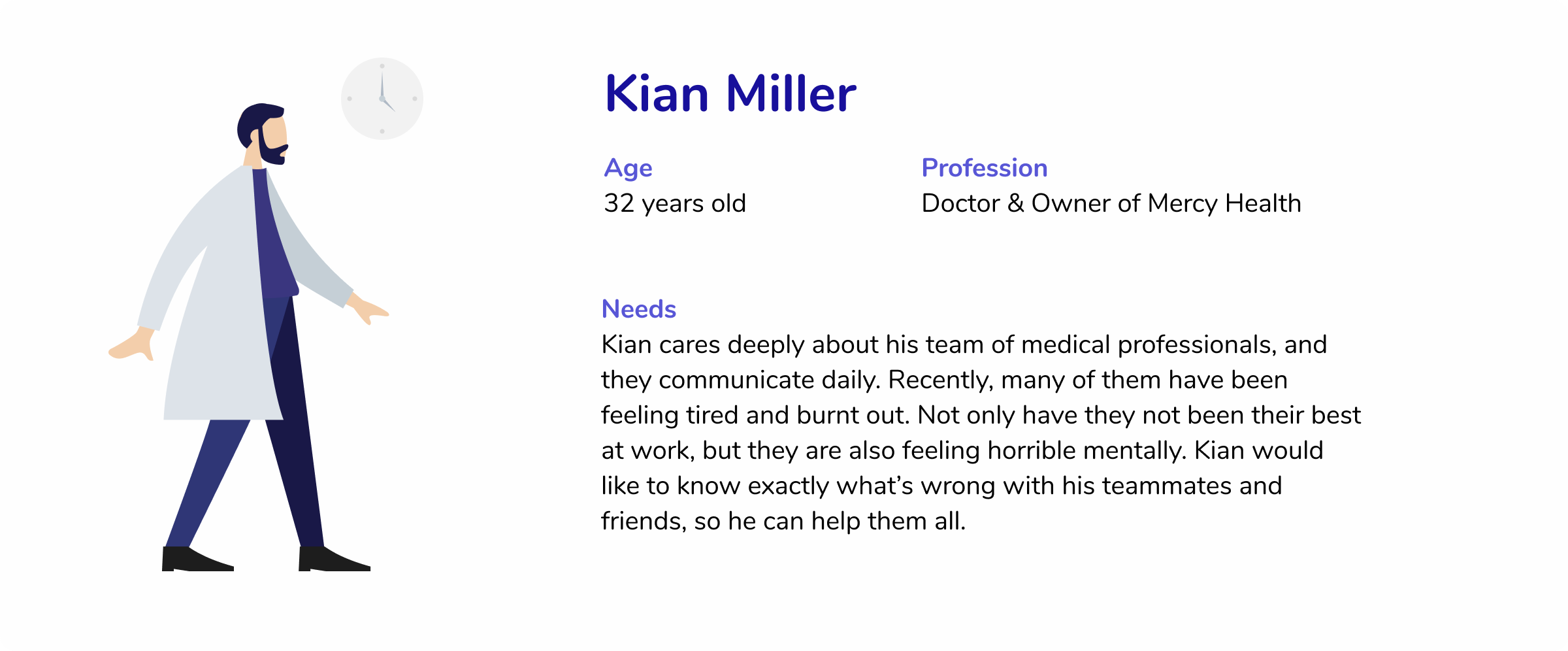
Cress Health is a startup that is creating applications to help nurses and doctors cope with stress, mental health, and burnout. Their applications offer peer support, journaling, and meditation activities, and this summer, they launched their first product: the Cress app! (They'e been recognized by Fast Company with a World Changing Idea Award for 2020!) Though they have worked hard on their app for nurses and doctors, their business products were lacking. As such, my team was tasked with creating a dashboard connecting Cress to clinics and businesses.
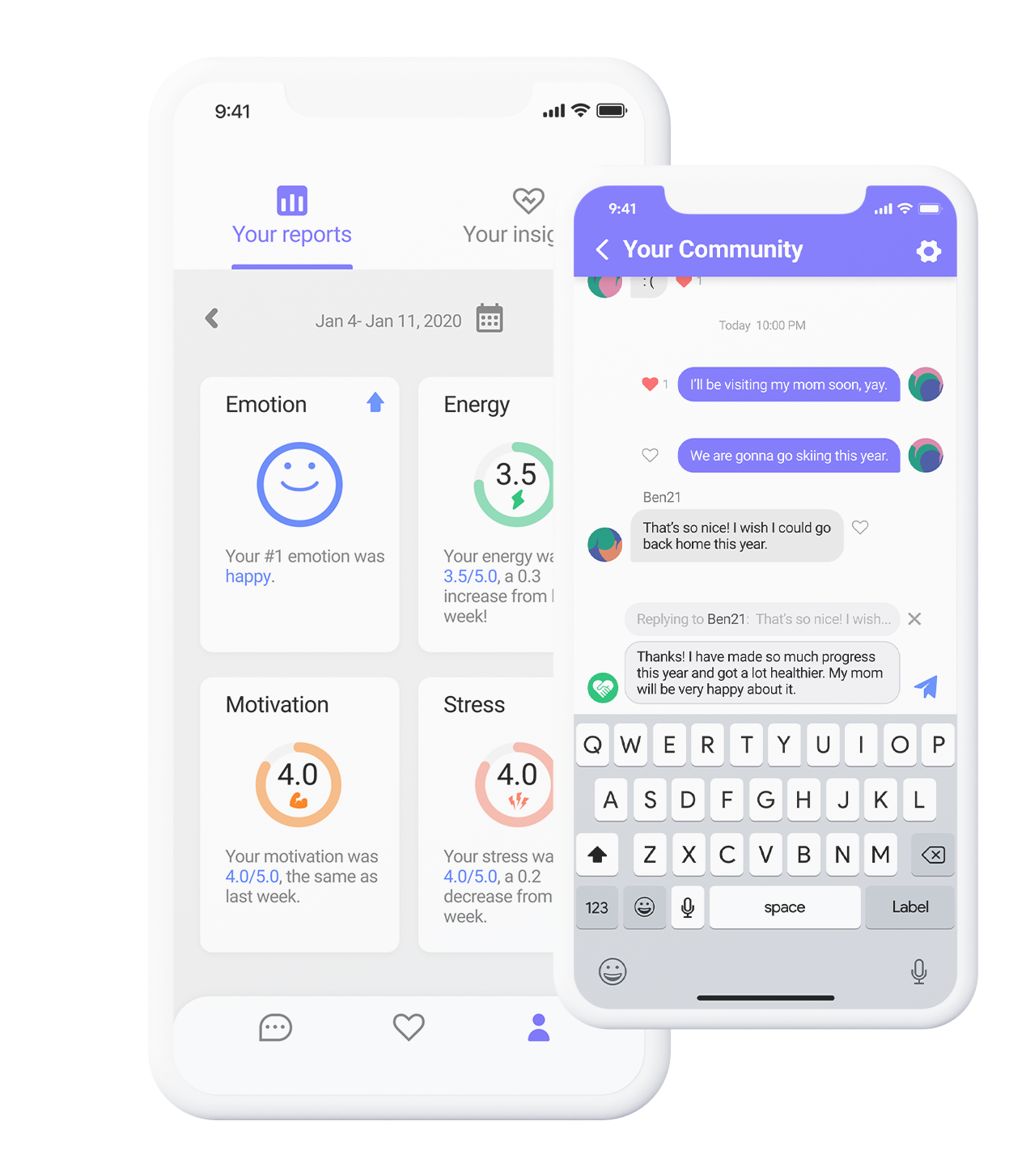
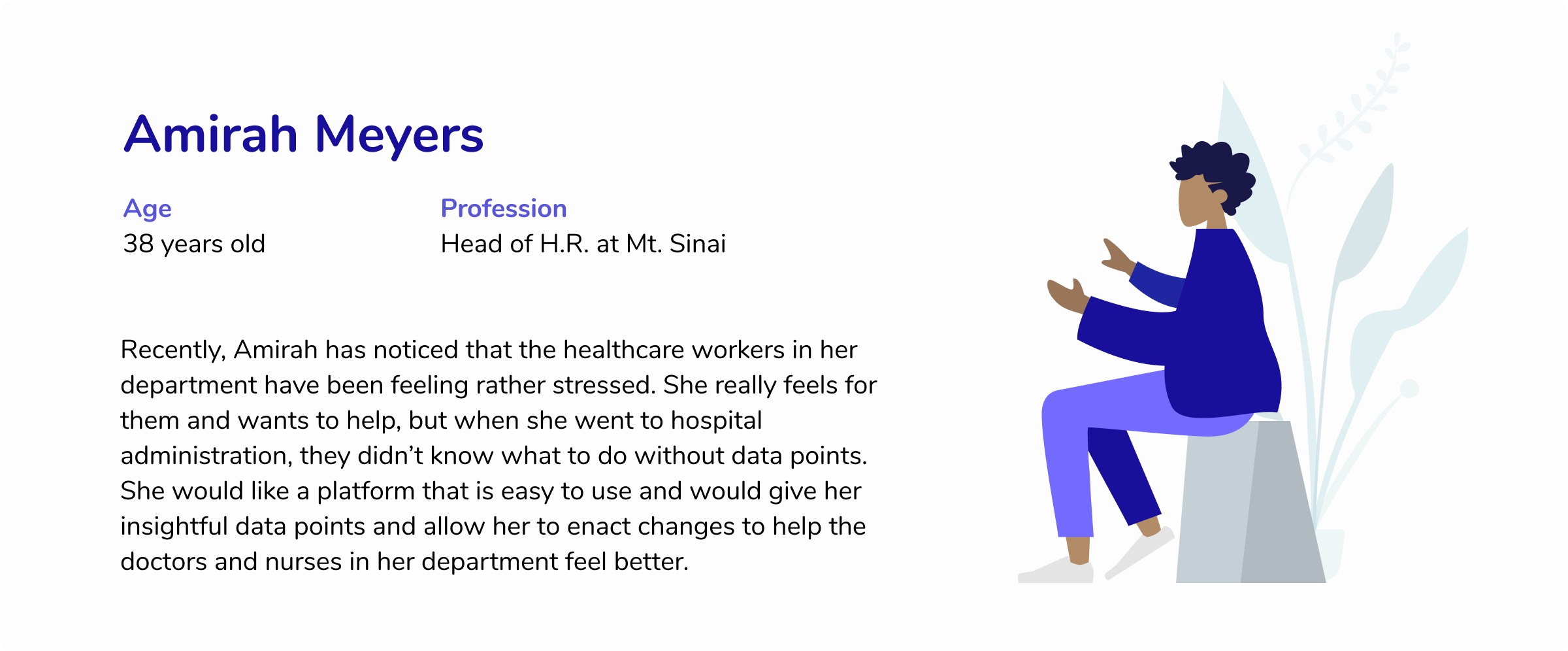
Such a dashboard would take self-reported insights from the Cress mobile app and package them in a way that clinics and HR teams could read and use to guide their actions. Clinics could sign up for this software, allowing Cress Health to earn revenue while empowering medical teams through their targeted, insightful applications.
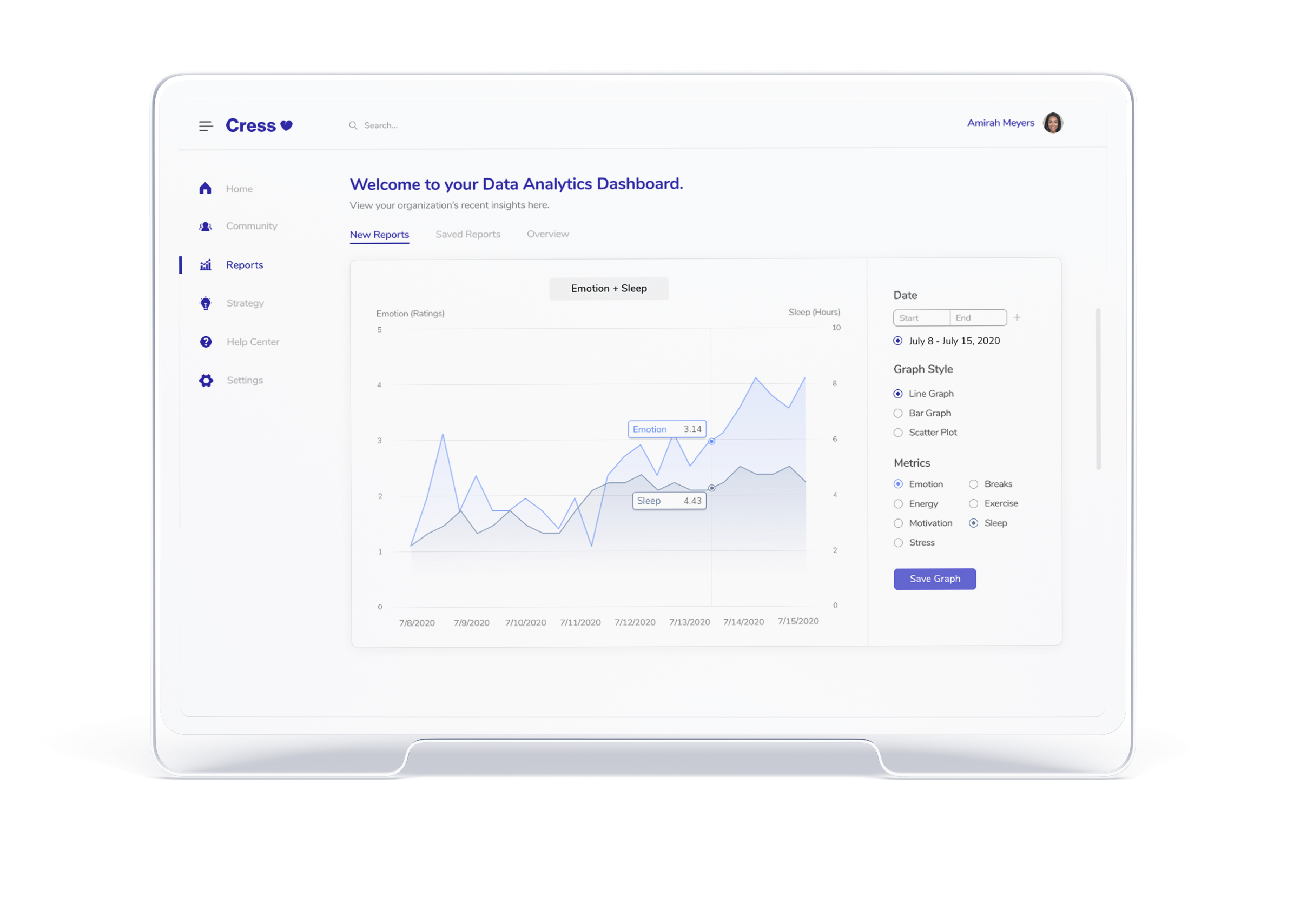
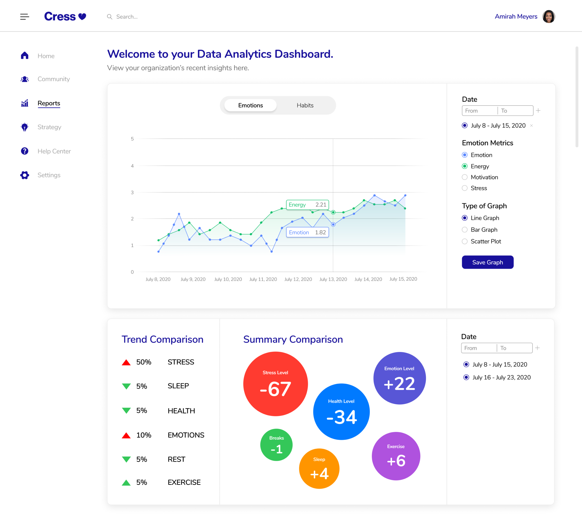
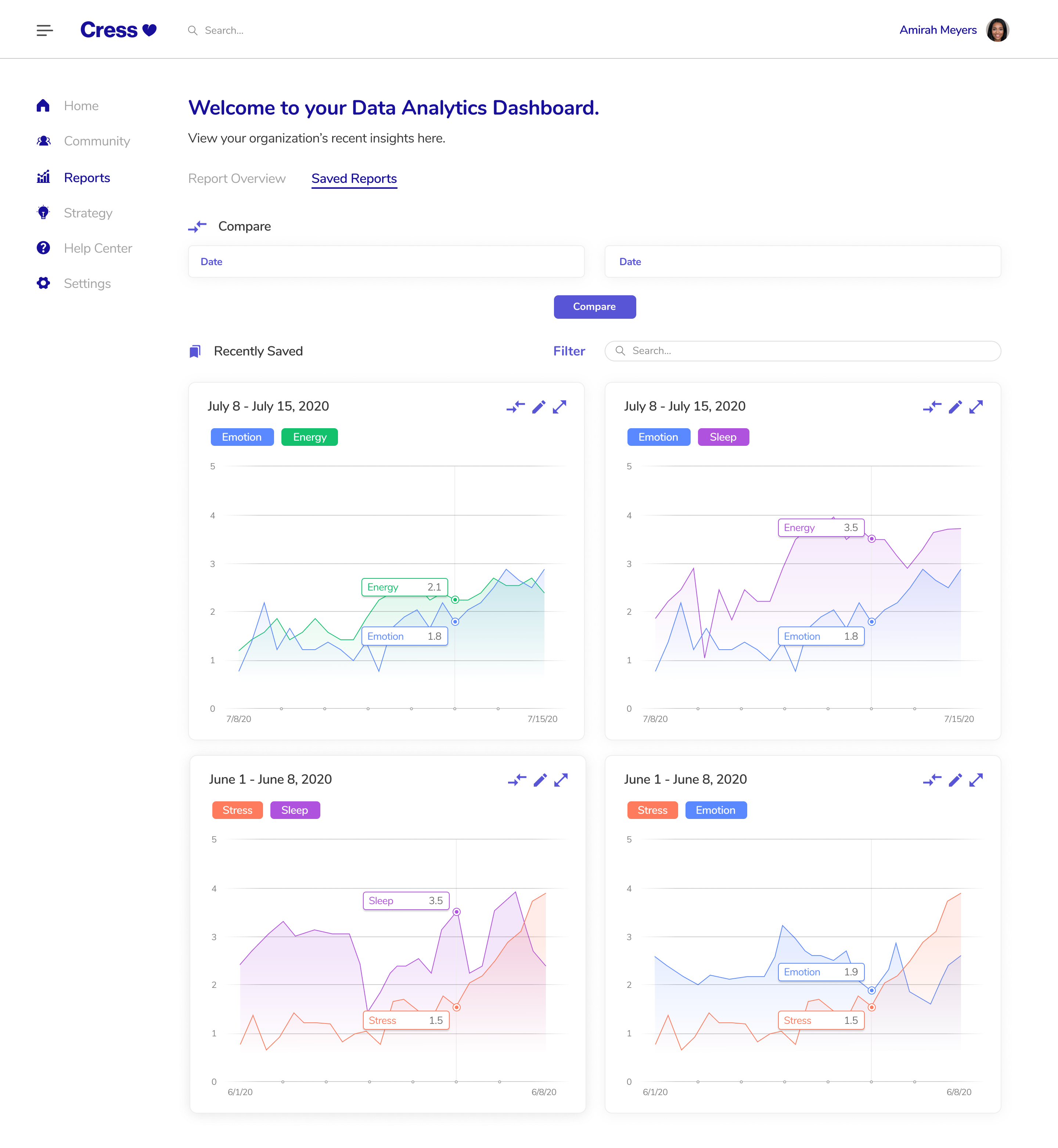
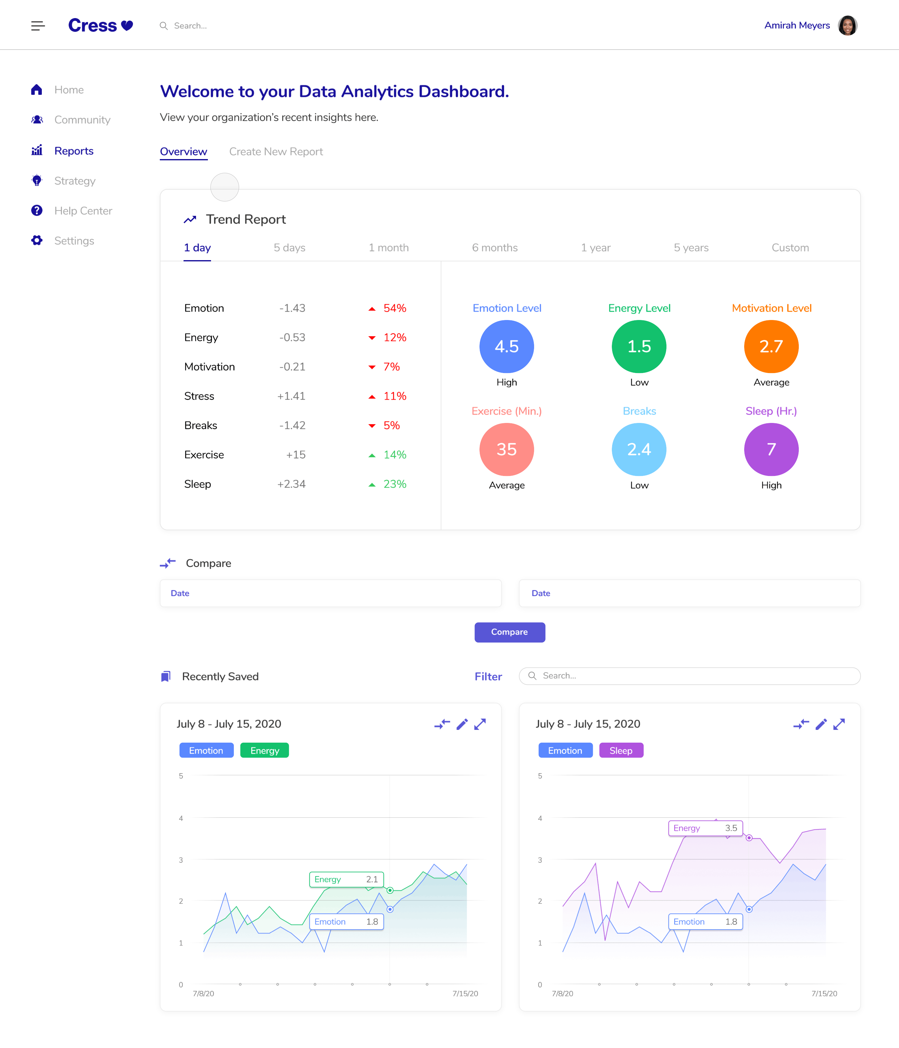
The New, Interactive Dashboard
Cress' Original Dashboard
We wanted to familiarize ourselves with the landscape of dashboards as Stephanie and I had not worked intimately with data presentation before. We learned the following:
We also had the chance to learn more about the dashboard from our managers and 5 potential clients (clinics, doctors, etc.) We gleaned the following:
Data can be packaged in easily accessible or complex ways, so we needed to better understand our audience before diving into our designs.
For our first designs, we just wanted to get our ideas our there. As such, it was rather simple. We decided that a main graph was important visually, centering that at the top. Moreover, we allowed users to customize that graph as they so pleased. Lastly, we wanted to summarize trends in the data so users could quickly understand changes over time and use that to check in on healthcare workers. The colors used were the ones Cress picked for their original applications.
Second Iteration
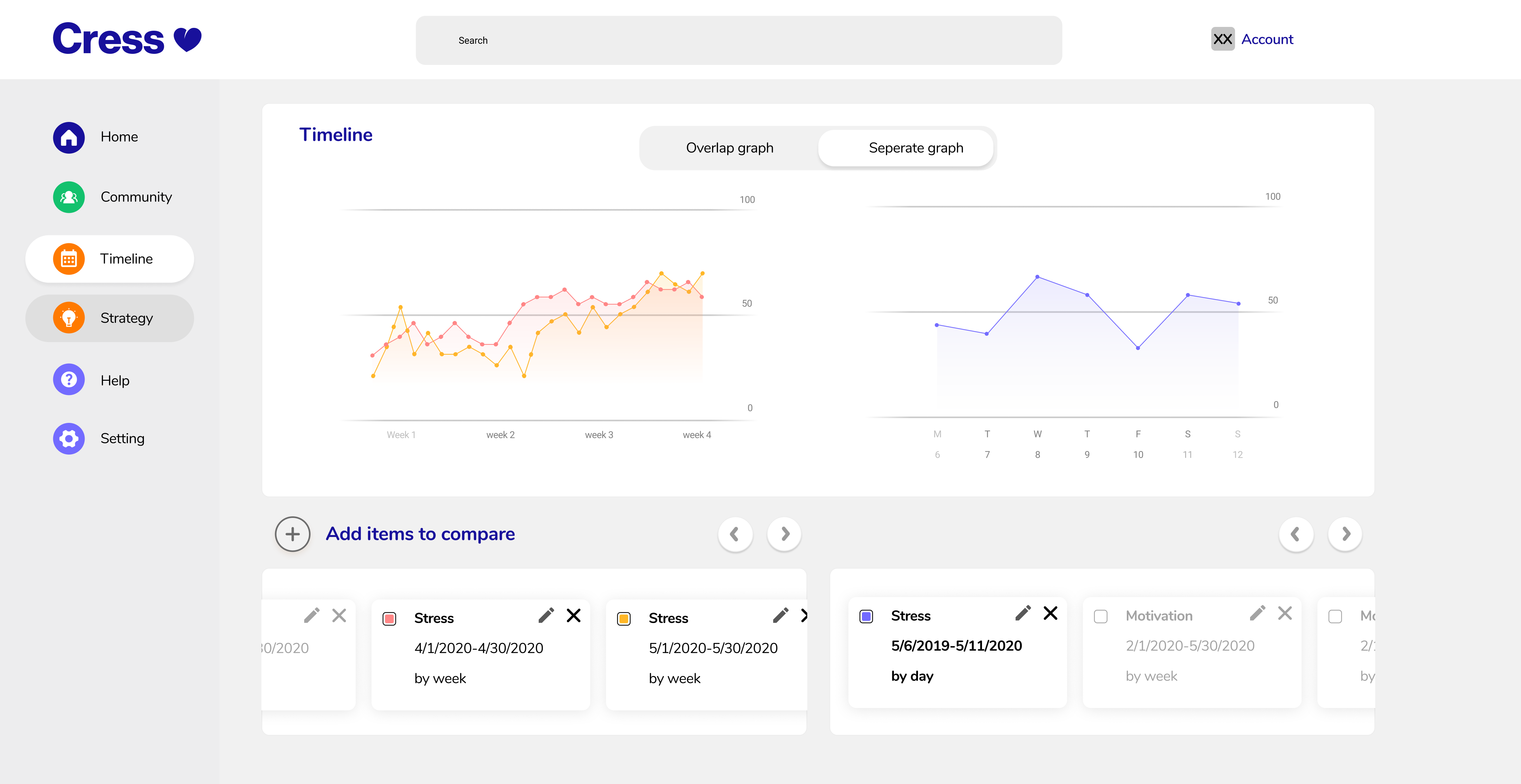
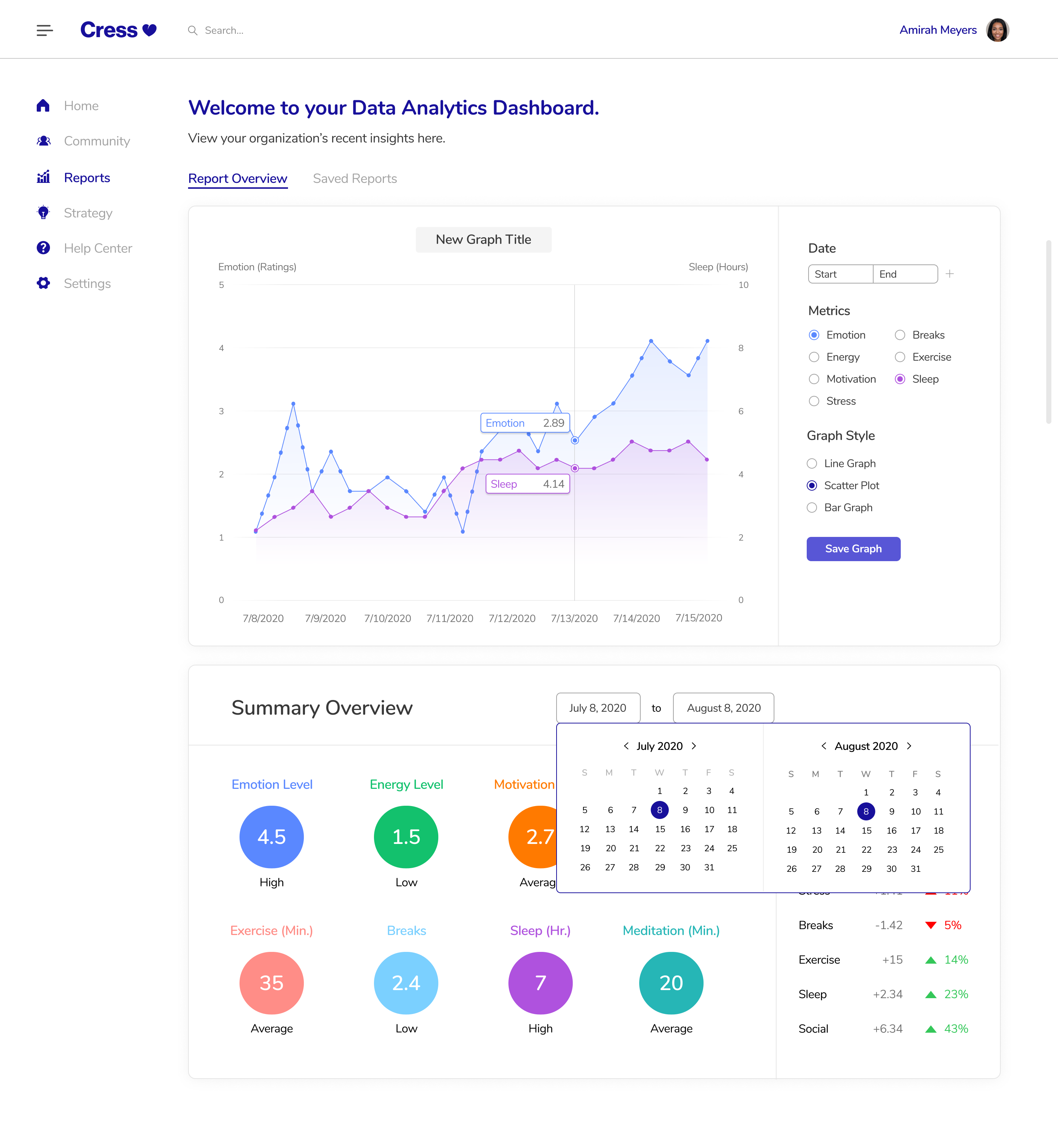
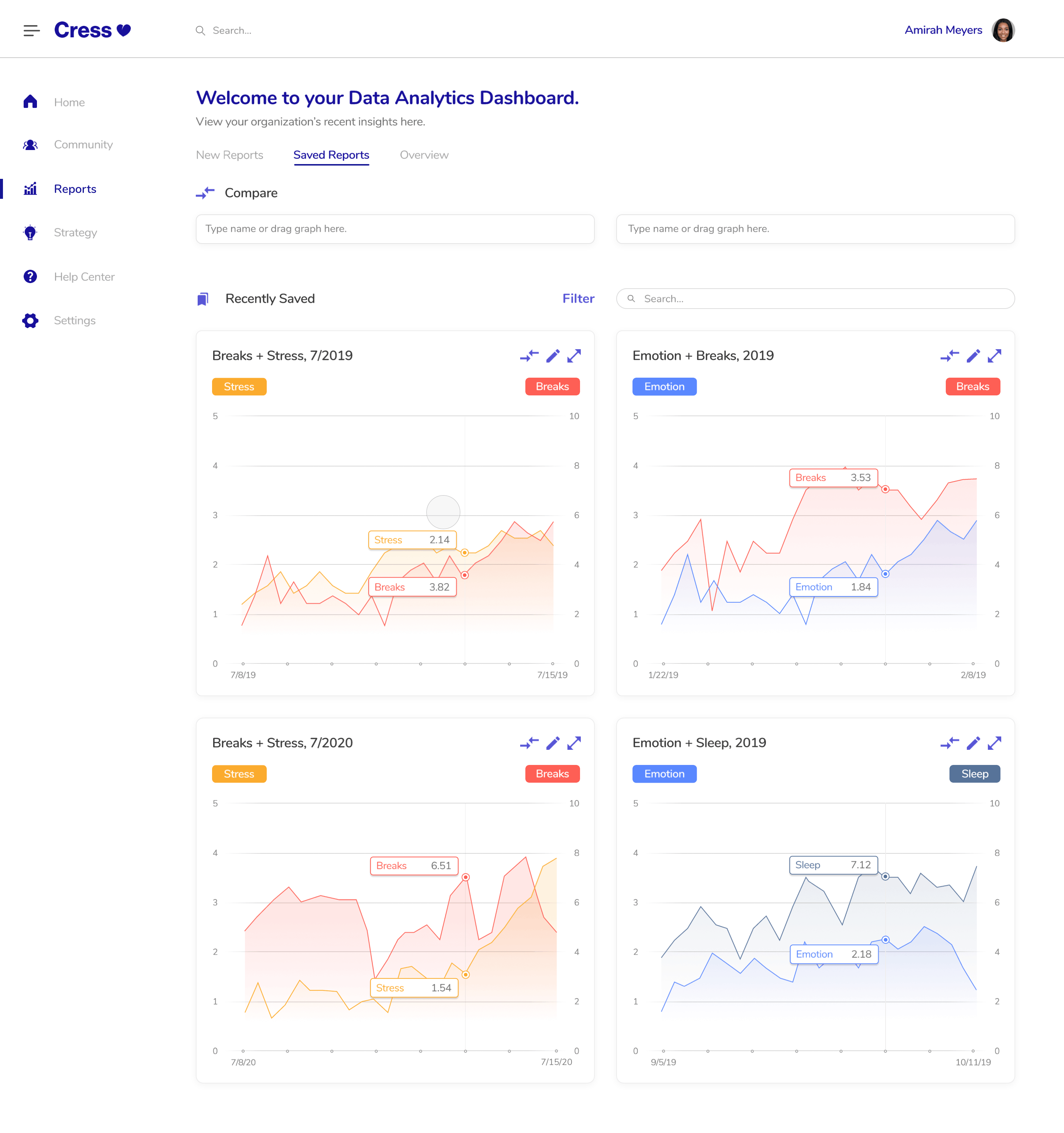
For our following iterations, we focused on more complex interactions. For example, we looked deeper into the UI/UX of date-picking and saving reports. These interactions required more involved thinking as we wanted the flow to be as smooth as possible. To ensure that users could get the most out of the data, we also added a feature that allows users to compare to graphs at once. Now, users could not only compare metrics over time on the same graph, but they could also compare such metrics across graphs.
Fourth Iteration
Sixth Iteration
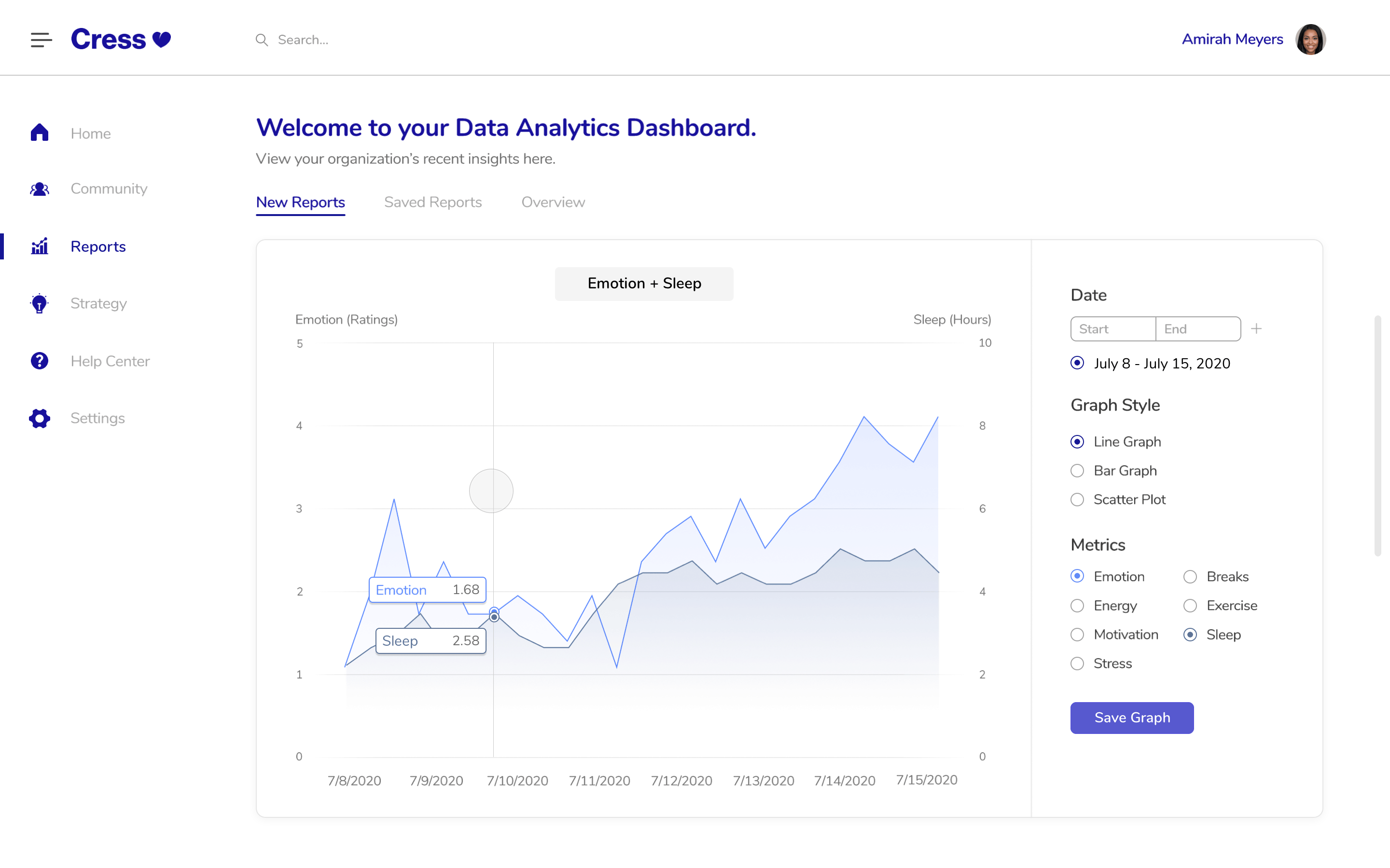
After some user and A/B tests and a meeting with the CEO and CFO,
we learned that users liked a large graph to be the first thing they saw. As such, we moved the
“Overview” to another tab and changed the view to better accomodate our feedback.
Some users also did not
like the original color scheme. They thought that it was too vibrant for a medical data dashboard, so we
worked with the mobile and branding teams to come up with a new, more mellow color scheme.
Lastly, in our final iteration, we decided on a simple date-picking system that’s charm would come from its interactions.
Below, you can see the user’s flow from adding metrics on a graph to saving that graph.
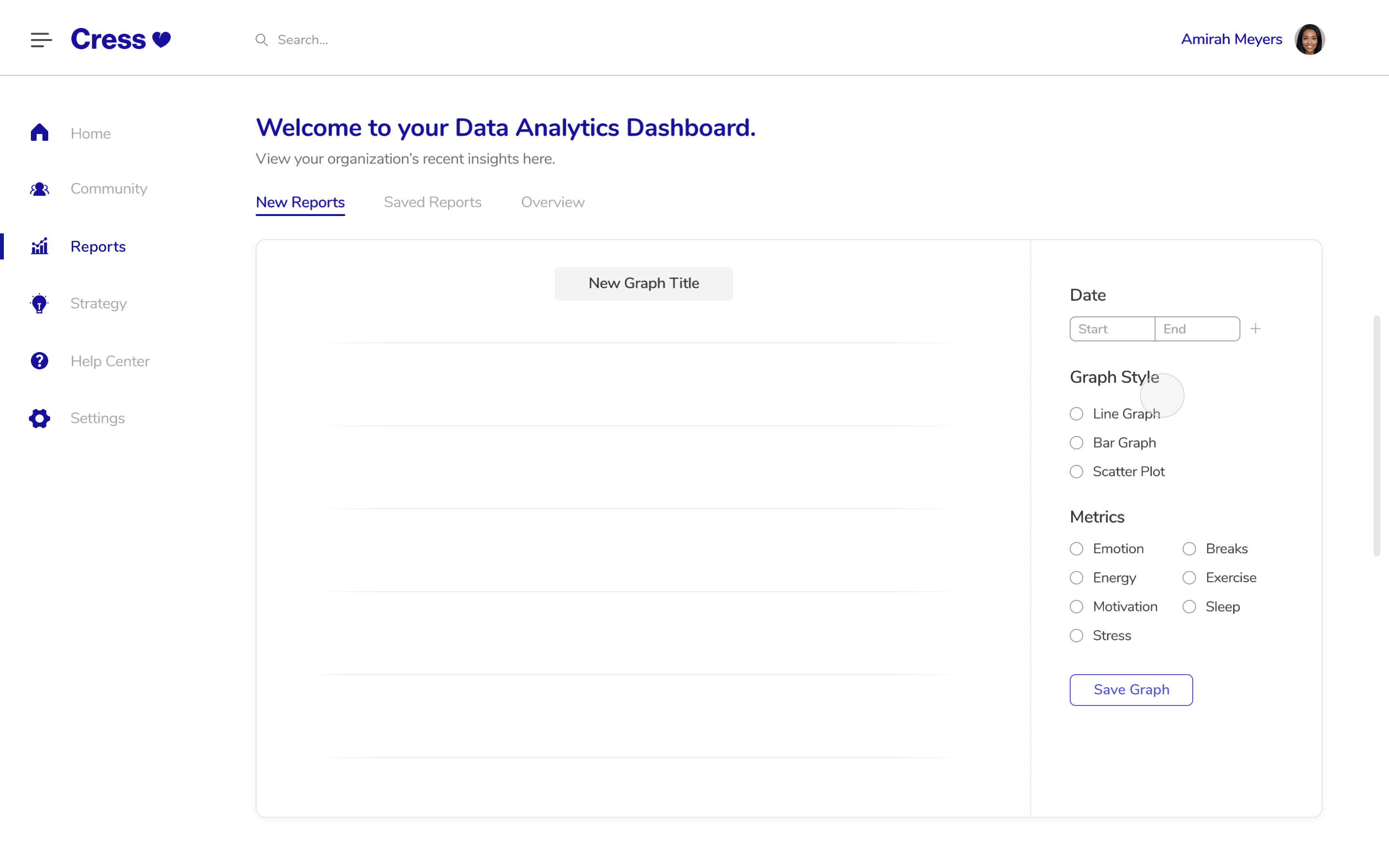
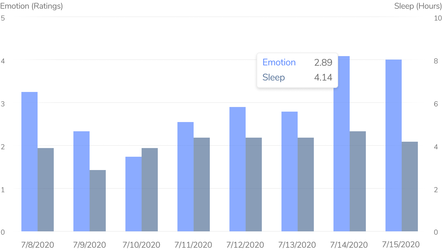
Users can also customize the way they would like their data presented. Line graphs help show changes over time, bar graphs summarize averages nicely, and scatter plots give more detailed insights regarding individuals.

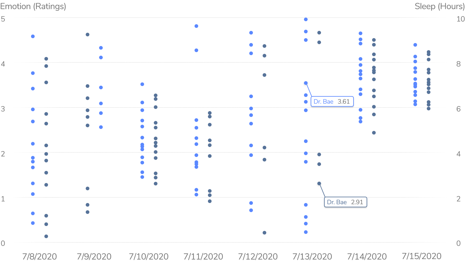
To empower our users even further, we decided to add a feature that
allows users to compare metrics across not only time, but also graphs. For example, this
would allow users to compare “Sleep” and “Emotions” from June 8, 2020 to June 15, 2020 and
also the same two metrics from June 8, 2019 to June 15, 2019 to see what has changed between
this year and last.
Because this feature can be quite complicated, we wanted to reserve an entire tab just for saved
graphs and comparisons under “Saved Reports.” When we originally tested with users, they said
that they would not be using this feature for more than 2 graphs most of the time, so we decided
to limit the comparisons in order to keep our dashboard user-friendly. They can either add a graph
to the comparison slot by typing in the name of a graph or dragging a graph to the allotted slot.
The trend reports in our first designs included circles. I thought that,
once animated, these would be fun to look at, but that’s all they would be: eye candy. Our user
tests corroborated this sentiment as many users did not know why data was being packaged into circles.
They felt that bars or some other visual may be better for showing comparisons and trends among the
different metrics.
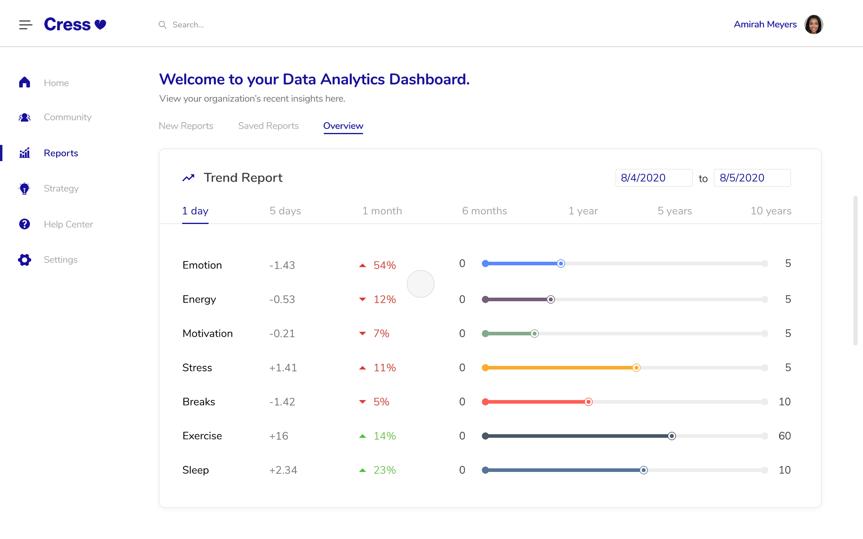
In our final iteration, we wanted to give users the freedom of customizing their trend reports while also
giving them quick shortcuts to select varying periods of time. The trend report is meant to compare all of
these metrics from one date to another. For example, in the prototype below, “Emotion” decreased by 1.83
from August 4 to August 5.
We ran through a couple more A/B and user tests to make sure the original feedback we received was applied properly. In the end, we presented our design to 20 other design interns, our 2 managers, C-suite, and even some potential clients. They all loved it and saw its value!
First, I learned about the importance of animations.
There obviously cannot be too many when the project is being delivered, but
animations can keep users engaged. I delved deeper into Principle. In fact, this was the first
project I've ever used drivers in!
In terms of process, I realized how important it is to understand one’s audience,
despite how much research exists on the internet for a certain feature (which was, in this case,
a dashboard.) Products should be perfectly tailored to their users every time! Our audience wanted to use insights
that were simple to read, and our product had a direct positive impact that I could feel.
Because of this, I reached an epitome about design: I am solving problems for other people and,
by doing so, making their lives a bit easier. In the end, I fell in love with design even more.
