An early-stage startup that makes booking flights easier.
Pilota predicts disruption information and gives safety insights about flights using AI and Google Flights' API. I helped them build out UI/UX experiences for their product’s initial launch. Some deliverables include landing pages, a COVID-19 dashboard, a flight details page, and more. I used Figma, Wix, and HTML/CSS to bring my designs to life.
WHO
As the sole designer on the team, I reported directly to the CEO.
WHEN
June 20 to September 17, 2020. Roughly 10 weeks.
Pilota is backed by Cornell Tech, 500 Startups, and Plug and Play. After two years, they launched their first product, FlySafe, this summer.
FlySafe offers users the ability to compare the safety metrics of flights and save them for future reference.
The company has been mentioned in Fortune 500, Forbes, TechCrunch, PhocusWire, Tech:NYC, and more!
FlySafe wants to
create products that seamlessly take users
through the flight booking process. This product is especially important right now because millions of people across
the world no longer feel safe flying during the current pandemic.
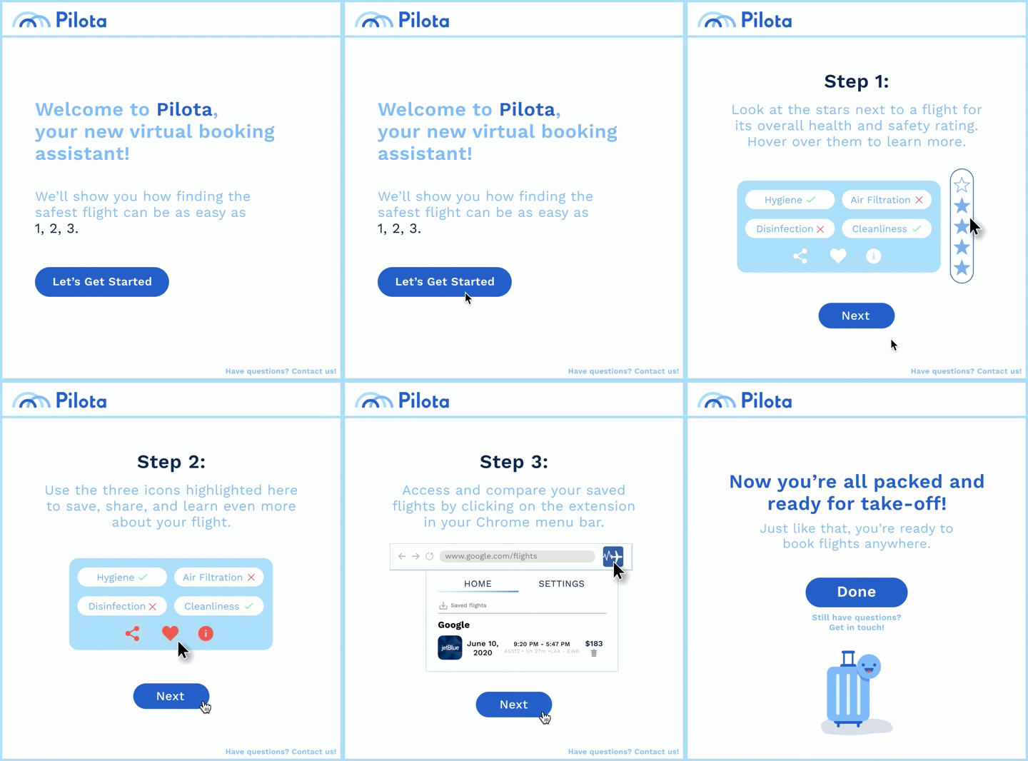
Below, you can view a tour guide of FlySafe that
I put together to get a better idea of how the extension works!
My first assignment was to redesign Pilota's
landing page before their soft launch. My work increased focus on the
CTA, bringing the ratio from 9:1 to 2:1. I also highlighted what makes Pilota cutting edge.
Scroll through the page below to get a feel for how the landing page looks!


To begin, I conducted research to learn more
about best practices for increasing conversion rates. I did not
engage in much interaction with users as the formula for a successful
landing page has already been researched thoroughly.
I learned that:
Landing pages should focus on the call-to-action (CTA).
The best ratio of other actions to the CTA is 1:1.
The page should communicate the product’s unique selling points.
There should be social proof for users to see the trustworthiness of the product.
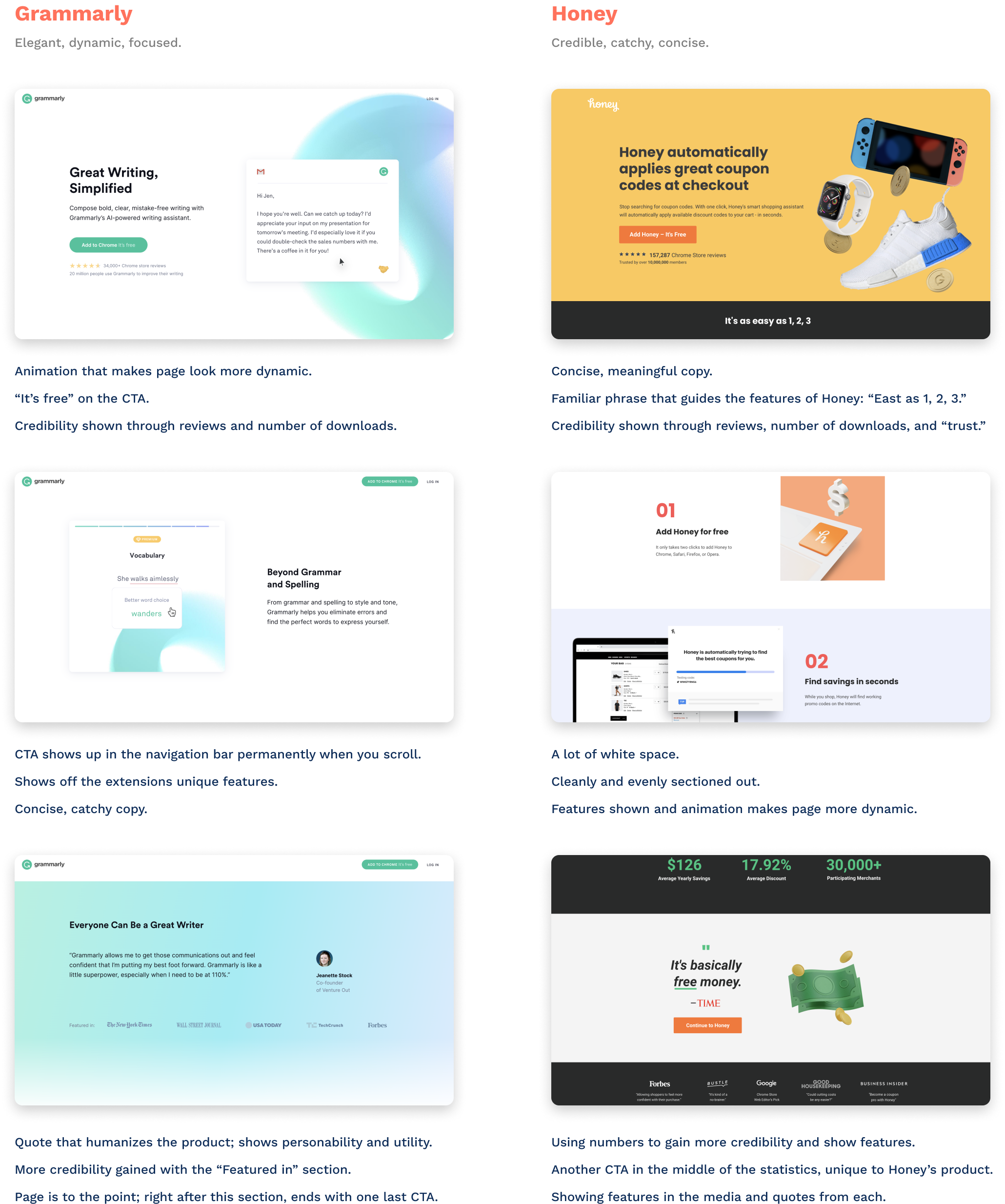
Since the Chrome Extension market only has a few leaders,
I decided to check out their landing pages to see what made them so succesful.
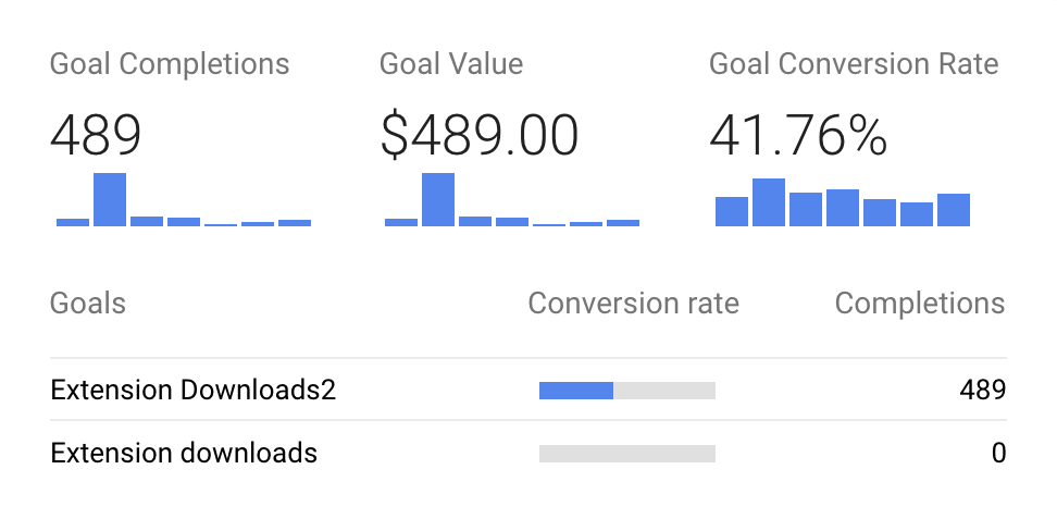
The landing page performed well! The product was launched the week of
July 12, and in its first month, the page had a conversion rate of ~42% as
opposed to the industry standard of 12-14%.
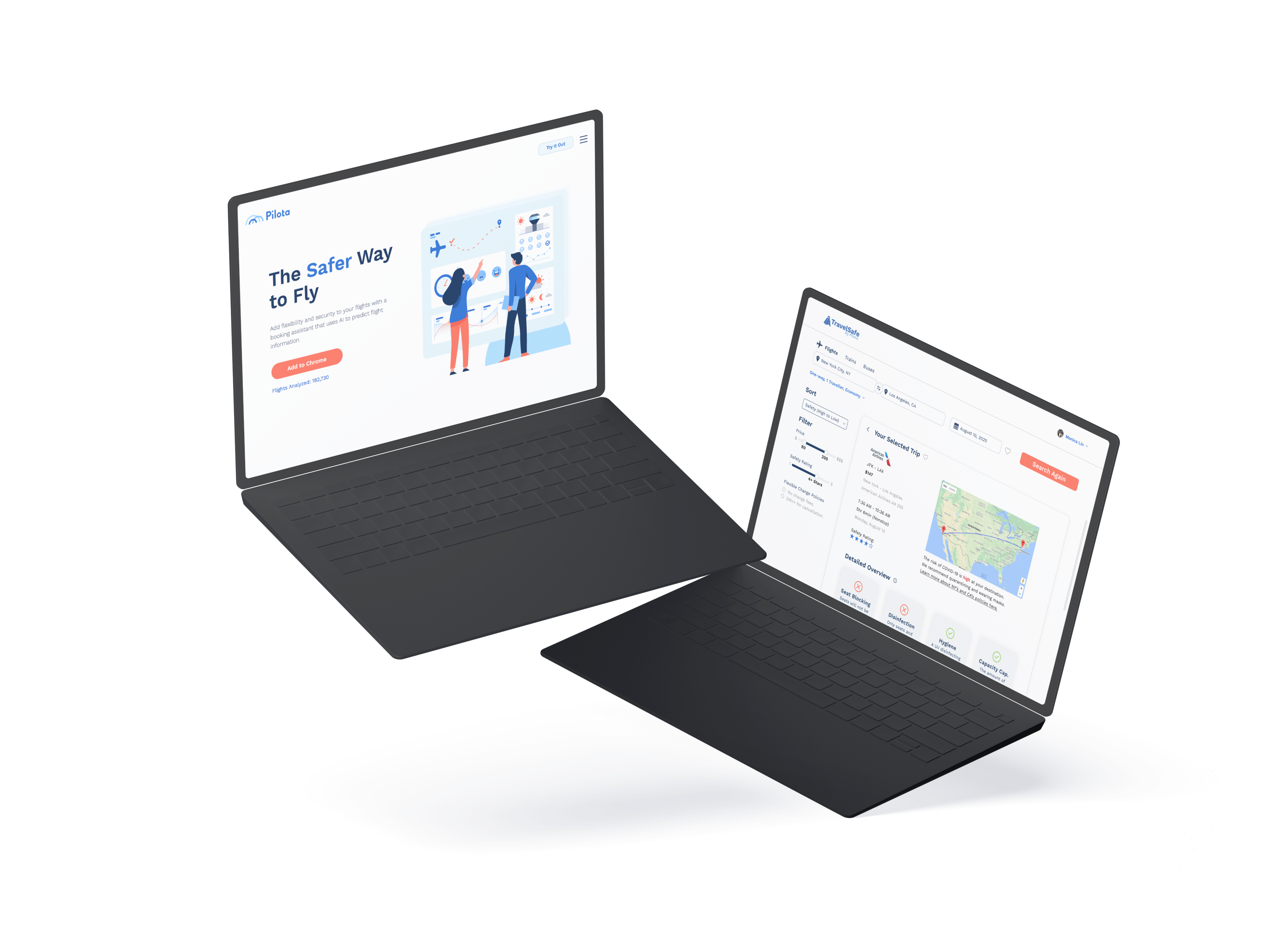
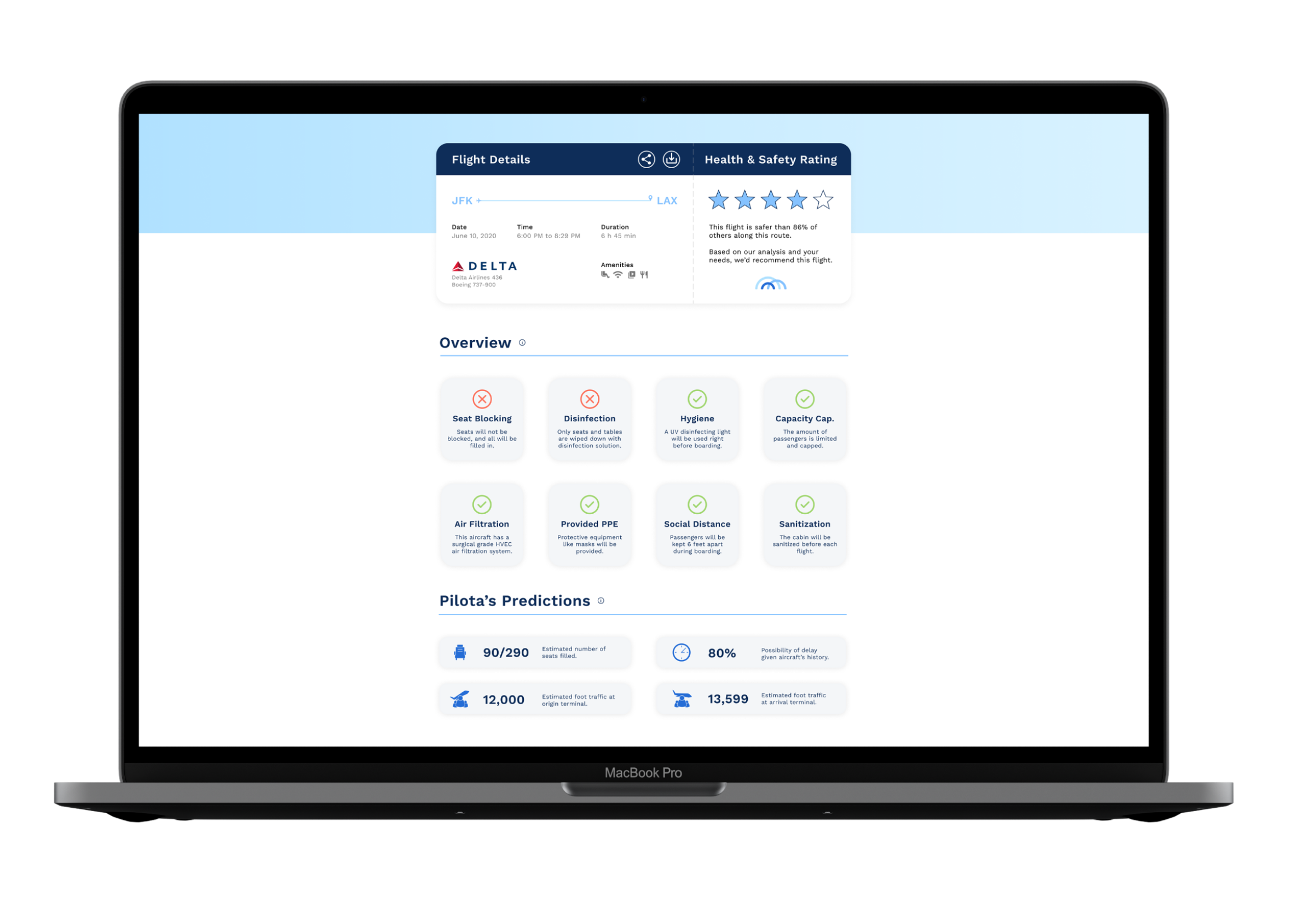
FlySafe's flight details page is what shows up when the user wants to learn more details about a flight, aside from the quick overview provided on the tooltip. This page was vital to FlySafe's product and has been featured in many news articles! I focused on making the most important pieces of data readable and formatting them in a unique design that represented the brand's product. I also made the design responsive.
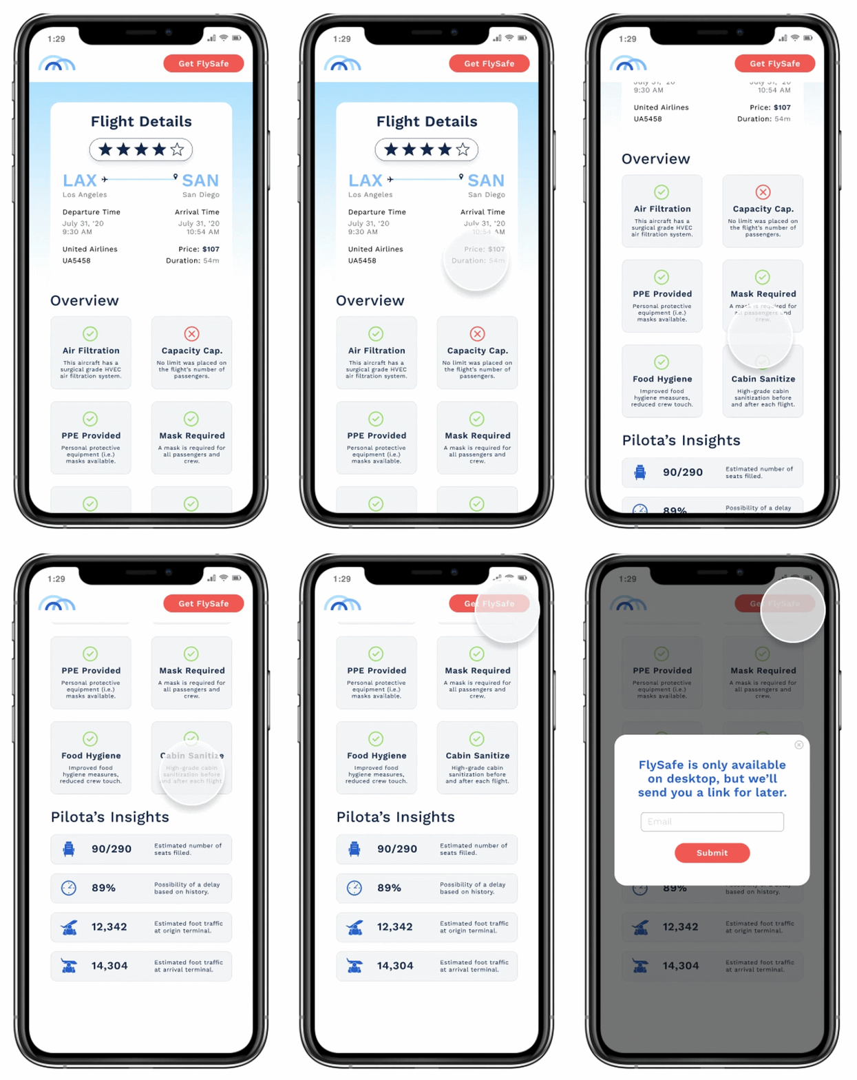
I was able to user test the flight details
page with 4 users myself and received feedback from 36 users
overall. Most users thought that the page was minimalistic, cute,
and easy to read. One piece of feedback was the the color of the filled-in
stars was not consistent from the tooltip to flight details page.
Additionally, users also wanted to see the price of
the ticket on the flight's summary. These changes were
implemented before the soft launch, and I incorporated them into the
mobile version straight away as I desiged that a week after.
Pilota's initial product launch of
FlySafe was quite succesful, and many investors were interested in what
Pilota would do next. One idea 500 Startups
recommended us was an application that travellers could use to assess
the safety of all modes of transportation.
I had a lot of responsiblity
with this project and wanted to design something that was not only in line with
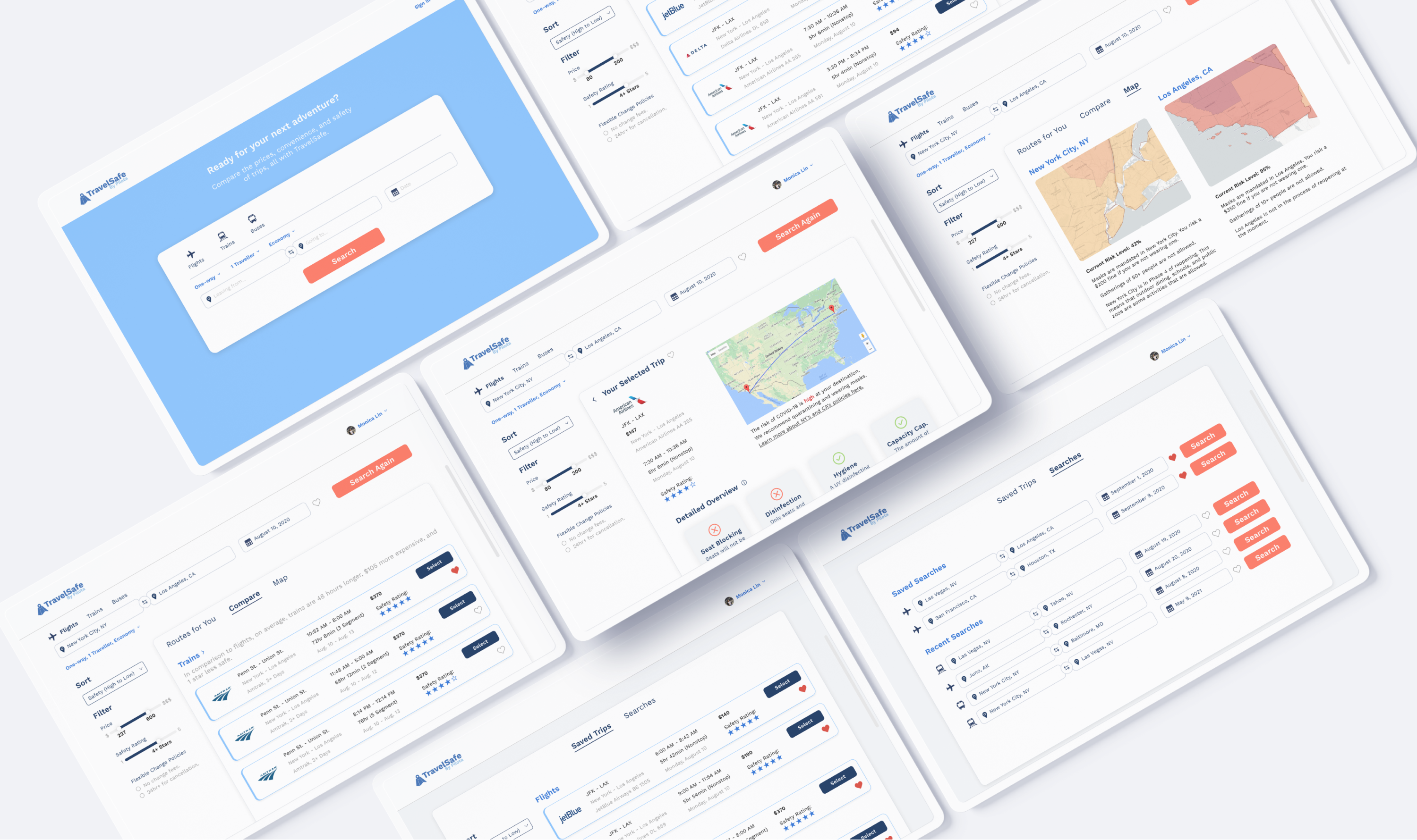
Pilota's existing assets and branding but also take it a step further.
